
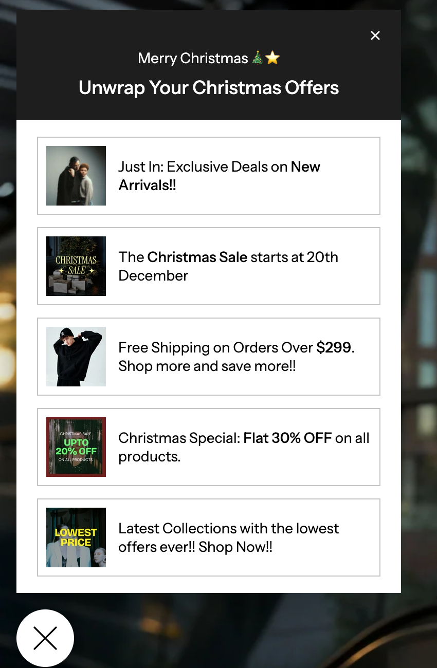
Announcement Popup
This pop-up is a powerful tool to grab a user's attention right away for special offers, important news, or seasonal campaigns. Here is a friendly guide to setting it up!
Section Settings
| Placement |
Decides where the pop-up button stays anchored on the screen.
|
| Desktop vertical position : | Use the slider or enter a pixel value to set the pop-up's distance from the top or bottom of the screen on desktop computers. |
| Mobile vertical position | Similarly, set the pop-up's distance from the top or bottom of the screen on mobile phones. |
| Section Content |
|
| Subheading: | A short, attention-grabbing phrase that sits above the main heading (e.g., "Limited Time Only," or "Summer Sale"). |
| Heading | The main, most important title of your announcement (e.g., "30% Off All Skincare," or "New Product Line Launch"). |
| Content alignment | Align the text within the pop-up to the left, center, or right. |
| Content color | Sets the color of the text (subheading and heading) inside the pop-up. |
| Highlight background | Sets the color of the background behind the subheading and heading. |
| Pop-up Button |
|
| Icon style: | Choose a small icon to display on the button (e.g., Percentage, Notification, Gift, Bolt, or Dollar). |
| Custom icon | If the default icons aren't right, click Select to upload your own image to use as the button icon. |
| Icon color |
|
| Button label | The short text that appears next to the icon on the button (e.g., "Offers," "New," or "Sale"). |
| Button label color | Sets the color of the text in the button label. |
| Button background | Sets the color of the button itself. |
| Button corner radius | Adjusts how rounded the corners of the button are. A higher number means rounder corners. |
Block Settings
| Image | Click Select to upload or choose an image for this specific offer or announcement. |
| Image shape: |
|
| Image corner radius | Use the slider or enter a pixel value to adjust how rounded the corners are on a Square image. A higher number means rounder corners. |
| Content & Action |
|
| Text | Enter the short, catchy text for this offer. This text will appear next to the image (e.g., "Grab the latest Offers!") |
| Link: |
|
| Open link in: | Choose whether the link opens in a New tab (keeping your store open in the background) or the Same tab. |
| Color scheme | Select a predefined color palette (Scheme 1, Scheme 2, etc.) from your theme settings. This ensures the card's background and text colors match your overall store design. |