
Editorial Content
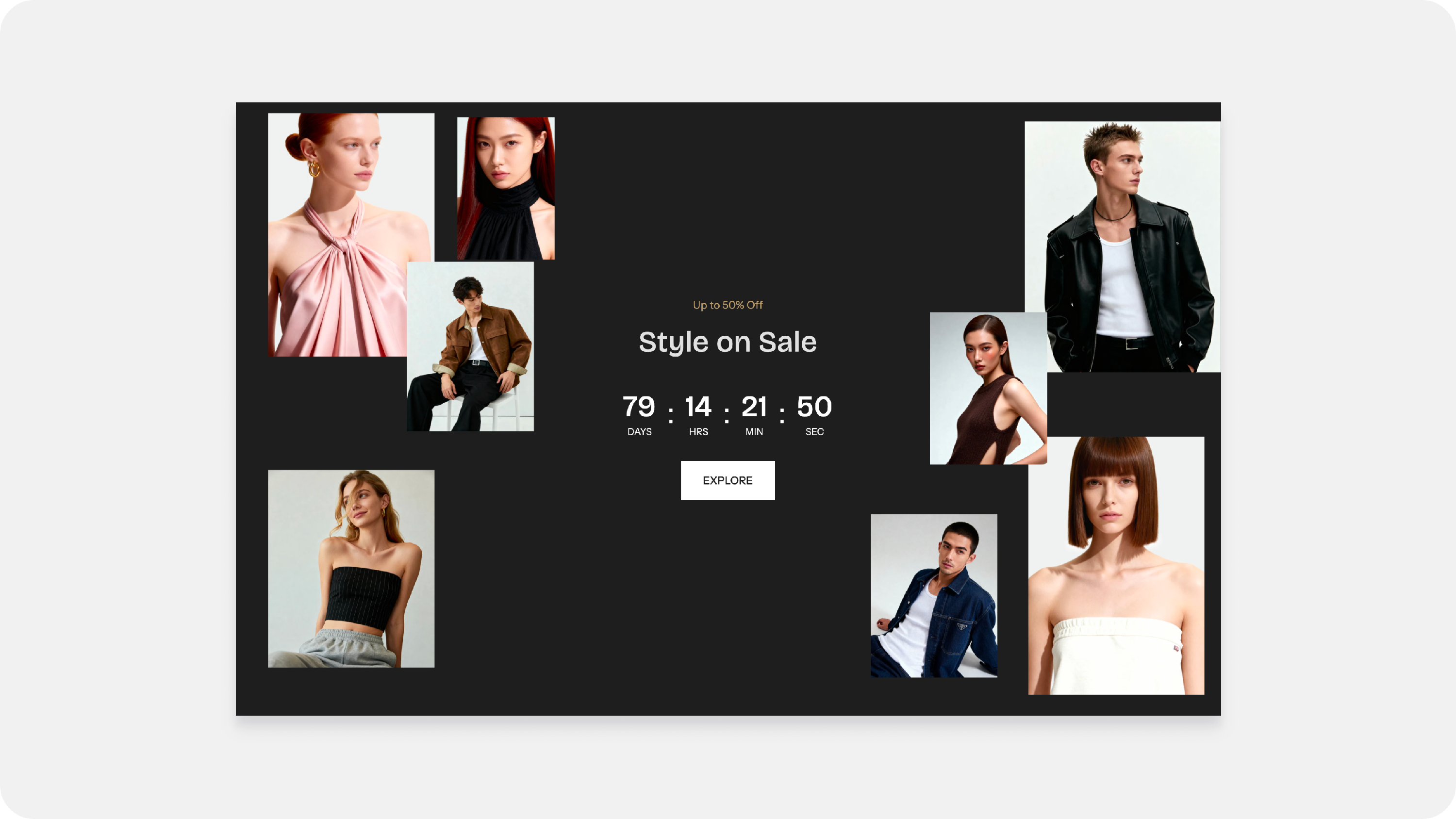
Available After Flawless 12.0
Overview
The Editorial Content section helps you create visually engaging, story-driven layouts that go beyond traditional product grids. Whether you're showcasing a seasonal collection, promoting a campaign, or creating a lookbook, this section lets you combine images, text, buttons, and countdown timers into a unique editorial experience.
Use it to highlight featured collections, announce upcoming sales, or build immersive homepage content that reflects your brand's style.
How It Works
The Editorial Content section consists of two parts:
- Section settings – Control the overall layout, spacing, colors, and alignment.
- Blocks – Add individual pieces of content such as images, headings, paragraphs, buttons, and countdown timers.
Arrange these blocks however you like to create a layout that matches your brand.
Section Settings
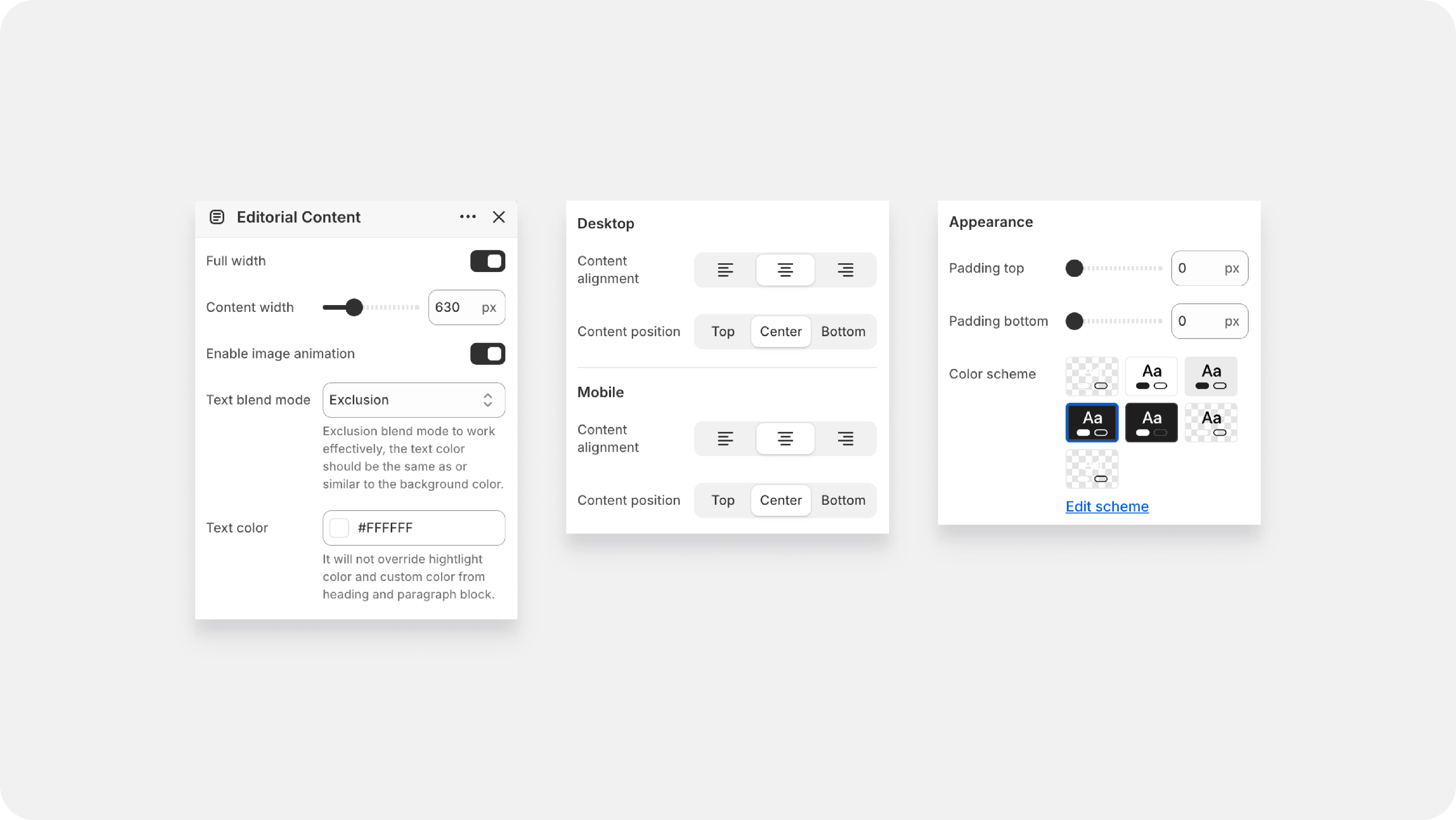
| Full Width | Choose whether the section spans the full width of the page, Stretches the section across the full browser width for a more immersive layout |
| Content Width |
Controls the maximum width of the main content area. Smaller values create a narrower text column, while larger values allow content to spread across more of the page. |
| Enable Image Animation | Give your editorial layout some life! Toggling this on adds smooth entrance animations to your floating images as the customer scrolls. |
| Text Blend Mode |
|
|
|
|
| Desktop and Mobile layout |
|
| Content alignment (Icons) | Left, Center, or Right-align your texts. |
| Content position (Top / Center / Bottom) | Choose where your content block sits vertically within the section. |
|
|
|
Blocks
You can build your custom layout using 5 different block types. Click Add block inside your section menu to start inserting these:
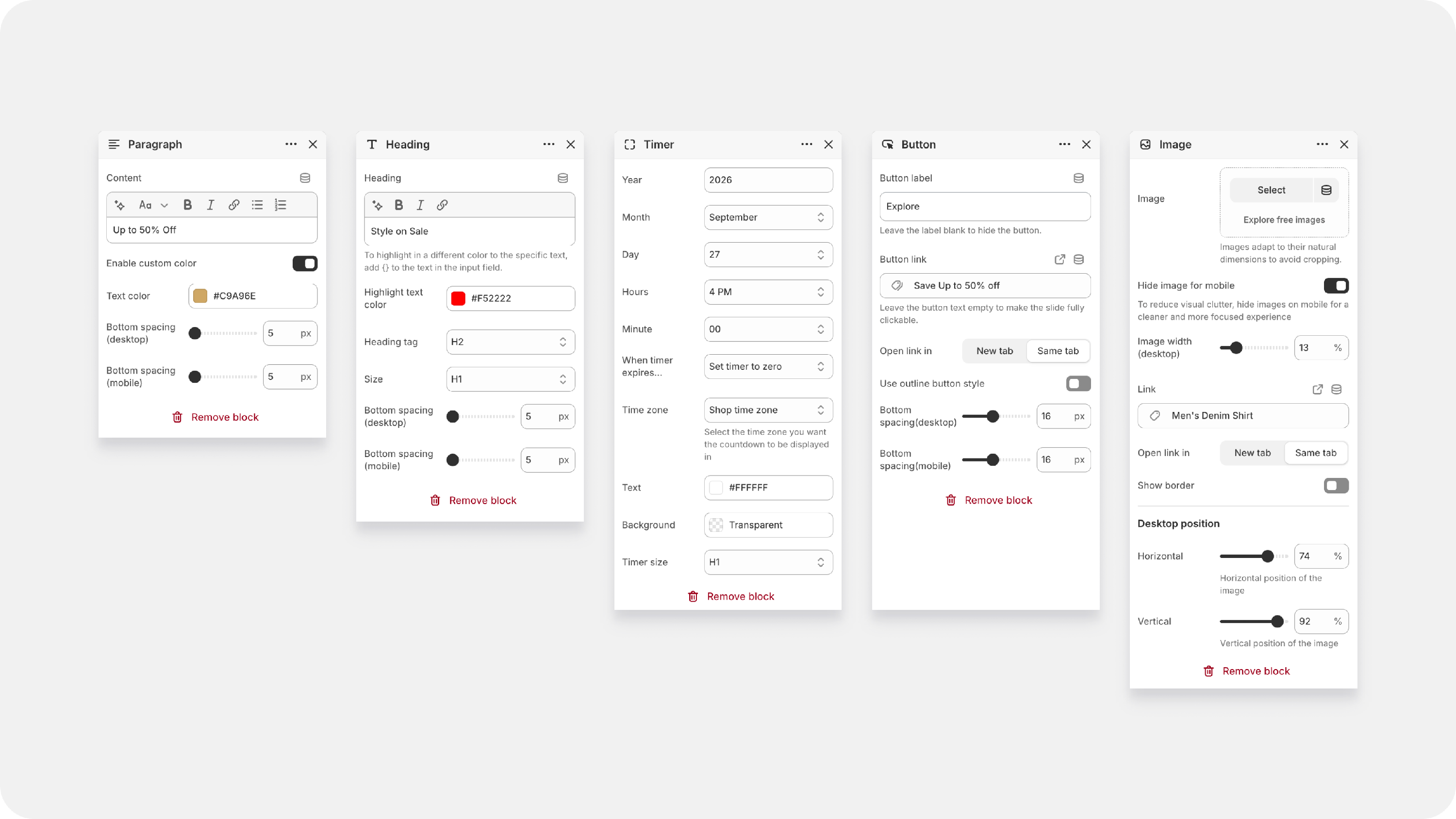
Image Block
This is where the editorial magic happens! Unlike standard slideshows, you can position multiple images freely using coordinates.
| Image Upload | Choose your visual. Images naturally adapt to their actual dimensions to prevent cropping. |
| Hide image for mobile(Toggle) | Mobile screens can get crowded. Toggle this on if you want certain images to only appear on Desktop. |
| Image width (Sliders) | Adjust the image size separately for desktop and mobile using percentage values. |
| Link | Make the image clickable by linking it to a product, collection, page, or external website |
| Open Link In | Choose whether the link opens in the Same tab or a New tab. |
| Show Border | Adds a border around the image. |
| Desktop & Mobile Position |
Adjust the horizontal and vertical position of each image independently for desktop and mobile. These controls make it easy to create layered or collage-style editorial layouts. |
Timer Block
| Date & Time Settings | Choose the year, month, day, hour, and minute when the countdown ends. |
| When timer expires (Dropdown) | Choose whether the countdown sets to zero, hides completely, or triggers another action. |
| Time zone | Select your store's time zone or user's local time zone. |
| Text / Background / Timer size | Easily customize the design look, sizing, and contrast of your countdown digits. |
Button Block
| Button label | Enter the text you want on your CTA button (e.g., "Explore Collection"). Leave this blank to hide the button entirely. |
| Button link | Paste any URL or select a collection, product, or page from your store. |
| Use outline button style (Toggle) | Switch between a solid filled button style or a clean, minimalist outline design. |
Tips
-
Position your images first, then add headings, paragraphs, and buttons to build your layout.
- Use highlighted text in headings to draw attention to important words or promotions.
- Keep paragraph text short so shoppers can quickly scan your content.
- Preview both desktop and mobile layouts before publishing.
- Hide decorative images on mobile if they make the layout feel crowded.
- Use multiple image sizes and positions to create a more dynamic editorial design