
Footer
The bottom of every page, built entirely from blocks (menus, newsletter signup, contact details, a news feed, a logo and free text) in the order you choose.
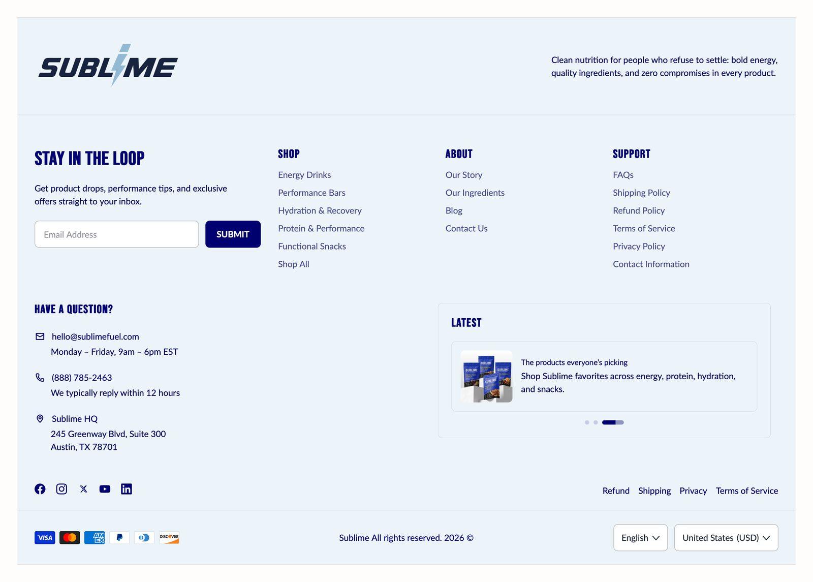
At a glance: Already in your theme. Find it in the Footer area of the left sidebar, on every page.
Good for
- Secondary navigation, like help, shipping and policy pages
- Growing your email list with a signup form on every page
- Showing contact details, payment methods and the country and language pickers
Section settings
Bottom bar
| Show social links | Shows the social icon row. Icons only appear for networks that have a URL saved in Theme settings → Social media.
On by default. |
| Show Follow on Shop button | Adds Shopify's Follow on Shop button, which lets shoppers follow your store in the Shop app. Shopify only shows it when Shop Pay is turned on for your store.
On by default. |
| Policy links | Displayed in the footer bottom bar. |
| Show payment icons | Shows icons for the payment methods your store accepts. The icons come from your payment settings, so you don't need to upload anything.
On by default. |
| Show language selector | Adds a language picker to the bottom bar. It only appears when your store has more than one published language.
Off by default. |
| Show country / currency selector | Adds a country picker to the bottom bar, which also sets the currency. It only appears when you sell to more than one country in Settings → Markets.
Off by default. |
Large footer logo
| Show logo | Adds an extra-large logo at the very bottom of the footer, below the copyright line. If you don't upload an image, your store name appears in large text instead.
On by default. |
| Logo | 2880 x 1280px (large) .jpg recommended.
Only appears when Show logo is on. |
| Desktop size | How wide the large logo is on desktop, as a percentage of the footer's width.
Adjustable from 10% to 100% (default 50%). Only appears when Show logo is on. |
| Mobile size | How wide the large logo is on mobile, as a percentage of the screen's width.
Adjustable from 10% to 100% (default 50%). Only appears when Show logo is on. |
Appearance
| Color scheme | Sets the background, text, border and button colors for the section. Schemes are defined once in Theme settings → Colors and reused everywhere, so changing a scheme updates every section using it. |
Spacing
Top and bottom spacing for desktop, with optional separate values for mobile. These are the same controls on every section. See Settings every section shares.
Blocks
Blocks are the individual pieces inside the section. In the sidebar, click Add block under the section to add one, and drag blocks to reorder them. The order in the sidebar is the order on the page.
Logo block
| Desktop width | Displayed width on desktop.
Adjustable from 20% to 100% (default 25%). Only appears when Style is Stacked. |
Logo
| Image | Logo image for this item.
2880 x 1280px (large) .jpg recommended. |
| Desktop logo width | Displayed logo width on desktop.
Adjustable from 10% to 100% (default 100%). |
| Mobile logo width | Displayed logo width on mobile.
Adjustable from 10% to 100% (default 50%). |
Tagline
| Tagline | A short line under the logo, such as a slogan or a one-sentence description of the store. |
| Heading size | Picks one of the heading sizes defined in Theme settings → Typography, so headings stay consistent across sections instead of being sized one by one.
Choose Default (default), H1, H2, H3, H4, H5 or H6. |
Layout
| Style | Visual treatment of the section.
Only applicable to desktop. Choose Stacked (default) or Horizontal. |
Menu column block
| Desktop width | Displayed width on desktop.
Adjustable from 10% to 100% (default 25%). |
| Heading | The section title. Leave it empty to hide the heading row entirely and let the content start at the top.
Leave blank to use the default tab name. |
| Heading size | Picks one of the heading sizes defined in Theme settings → Typography, so headings stay consistent across sections instead of being sized one by one.
Choose Default (default), H1, H2, H3, H4, H5 or H6. |
| Menu | Which menu to show. Menus are built in the admin under Content → Menus. |
Newsletter block
| Desktop width | Displayed width on desktop.
Adjustable from 20% to 100% (default 25%). |
| Heading | The section title. Leave it empty to hide the heading row entirely and let the content start at the top. |
| Heading size | Picks one of the heading sizes defined in Theme settings → Typography, so headings stay consistent across sections instead of being sized one by one.
Choose Default (default), H1, H2, H3, H4, H5 or H6. |
| Description | Smaller supporting line under the heading. |
| Email placeholder | Grey prompt text shown in the empty email field. |
| Button label | Text on the button. Leave it empty to hide the button. Two or three words reads best. |
Contact block
| Desktop width | Displayed width on desktop.
Adjustable from 20% to 100% (default 25%). |
| Heading | The section title. Leave it empty to hide the heading row entirely and let the content start at the top. |
| Heading size | Picks one of the heading sizes defined in Theme settings → Typography, so headings stay consistent across sections instead of being sized one by one.
Choose Default (default), H1, H2, H3, H4, H5 or H6. |
| The email address to show. Shoppers can click it to open their mail app. | |
| Description | A small line under the email address, for example We reply within 24 hours. |
Phone
| Phone number | Phone number as you want it displayed, including country code. |
| Description | A small line under the phone number, such as your opening hours. |
Store location
| Label | The first line of the location, usually the store or city name. It isn't a link. |
| Description | The address or directions under the label. Line breaks you type are kept. |
News feed block
| Desktop width | Displayed width on desktop.
Adjustable from 30% to 100% (default 40%). |
| Heading | The section title. Leave it empty to hide the heading row entirely and let the content start at the top. |
| Heading size | Picks one of the heading sizes defined in Theme settings → Typography, so headings stay consistent across sections instead of being sized one by one.
Choose Default (default), H1, H2, H3, H4, H5 or H6. |
Post 1–5
Each of the 5 posts has the same settings, set separately for each one.
| Image | 2880 x 1280px (large) .jpg recommended. |
| Heading | The post's heading. It links to the page you set in Link. |
| Description | A short summary under the heading. Line breaks you type are kept. |
| Link | Where the post heading links to, usually the full blog article. A post with no Heading has nothing to link. |
| Open link in new tab | Opens the post link in a new browser tab. This is best for links that leave your store.
Off by default. |
Slideshow
| Slide duration | How long each post is shown before the feed moves on. The feed always rotates by itself.
Adjustable from 1s to 10s (default 2s). |
Text block
| Desktop width | Displayed width on desktop.
Adjustable from 20% to 100% (default 25%). |
Content
| Heading | The section title. Leave it empty to hide the heading row entirely and let the content start at the top. |
| Heading size | Picks one of the heading sizes defined in Theme settings → Typography, so headings stay consistent across sections instead of being sized one by one.
Choose Default (default), H1, H2, H3, H4, H5 or H6. |
| Text | The text content of this block. |
Button
| Button label | Text on the button. Leave it empty to hide the button. Two or three words reads best. |
| Button link | Where the button goes. A button with no link is not shown.
Only appears when Button label is not blank. |
| Open link in new tab | Opens the button link in a new browser tab. Best kept for links that leave your store.
Off by default. |
| Button style | Picks one of the button styles defined in Theme settings → Buttons: primary, secondary or tertiary.
Choose Primary (default), Secondary or Tertiary. |
| Button icon | Optional icon shown after the button label.
Choose None (default), Arrow left, Arrow right, Arrow up, Arrow down, Chevron left, Chevron right, Chevron up, Chevron down, Arrow up right, Plus, Minus, Cross, Check, Play, Cart, Shopping cart, Search, Link, Download, Envelope, Home, Edit, User, Login, Heart, Chat, Filter, Trash, Share, Phone, Map pin or Eye. |
Tips
- Plan each row to add up to 100%. Every block has a Desktop width, so four blocks at 25% fill one row. Blocks wrap onto a new row when the widths add up to more than that.
- Put your policies in the bottom bar. Pick a menu under Policy links for refund, privacy and terms pages, and keep the main columns for pages shoppers actually browse.
- Keep news feed posts short. Each post rotates on its own after Slide duration, so a heading and one line of description is all most shoppers will read.
Troubleshooting
Where do newsletter signups go?
Each signup is saved as a customer in your Shopify admin, subscribed to email marketing and tagged newsletter. You can find them under Customers, and send to them with Shopify Email or any email app connected to your store.
The payment icons aren't showing
They're pulled from the payment methods switched on in Settings → Payments. If no methods are active yet, for example on a development store, there's nothing to show.
The country or language selector is missing
Each one only appears when there's a choice to make. The country selector needs more than one country in Settings → Markets, and the language selector needs more than one published language.