
Pop-up
A pop-up for signups, offers or announcements. It opens after a delay or once the shopper scrolls, and you build it from heading, text, button, countdown and newsletter blocks. Once a shopper closes it, it stays hidden for as many days as you choose.
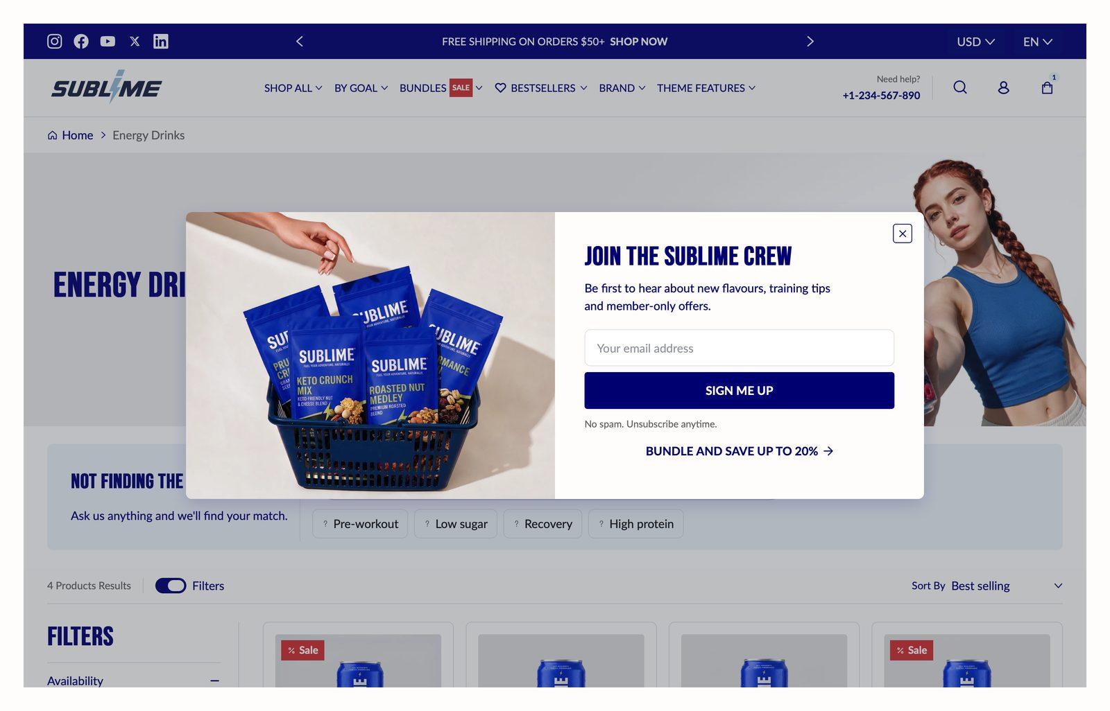
At a glance: Already in your theme. Find it in the Overlay area of the left sidebar, on every page.
Good for
- Collecting email signups with a first-order discount
- Announcing a sale with a countdown
- Pointing new visitors to a featured collection
Test the pop-up
- In the theme editor, click Popup in the left sidebar to preview it. The pop-up opens while the section is selected and closes when you click away. In the editor, the trigger, visitor rules and Show again after are ignored.
- To test the real trigger, open your store in a private or incognito window. Wait for the Delay, or scroll past the Scroll position.
- Close the pop-up. Your browser now remembers that for the number of days set in Show again after, and the pop-up won't open again in that browser.
- To see it again, open a new private window, or clear your browser's cookies for your store (the cookie is called
popup-dismissed). If Show again after is0, closing the browser is enough. - If it still doesn't open, sign out of your customer account when either visitor option is on, and check whether Show on home page only is on.
Section settings
General
| Show on home page only | Shows the pop-up only on the home page. With this off, it can open on any page.
Off by default. |
| Hide for account holders | Hides the pop-up from customers who are signed in to their account.
Off by default. |
| Show for visitors only | Shows the pop-up only to shoppers who aren't signed in.
Off by default. |
| Content alignment | Aligns the text content within its column.
Default: Left. |
| Show again after | Number of days before showing the pop-up again.
Adjustable from 0day to 100day (default 30day). |
Trigger
| Trigger | Delay opens the pop-up a set number of seconds after the page loads. On scroll opens it once the shopper has scrolled a set distance down the page.
Choose Delay (default) or On scroll. |
| Delay | How many seconds after the page loads the pop-up opens. 0 opens it right away.
Adjustable from 0s to 60s (default 15s). Only appears when Trigger is Delay. |
| Scroll position | How far down the page the shopper scrolls, as a percentage of the page's length, before the pop-up opens. On pages too short to scroll, it opens right away.
Adjustable from 0% to 100% (default 30%). Only appears when Trigger is On scroll. |
Layout
| Pop-up layout | Default is a centered window over a dimmed page, with an optional image. Mini is a small card in a bottom corner, stretched along the bottom edge on mobile, with no dimming and no image.
Choose Default (default) or Mini. |
| Overlay opacity | Darkens the image behind the text so the text stays readable. Higher values mean a darker image.
Adjustable from 0% to 100% (default 30%). Only appears when Pop-up layout is Default. |
| Show image | Shows the image for this item.
Displays an image alongside the content. Off by default. Only appears when Pop-up layout is Default. |
| Desktop image | Background image used on desktop.
2880 x 1280px (large) .jpg recommended. Only appears when Pop-up layout is Default and Show image is on. |
| Disable image on mobile | Hides the image on phones, so the pop-up shows only its content there.
Off by default. Only appears when Pop-up layout is Default and Show image is on. |
| Mobile image | A separate image used on mobile. Leave empty to reuse the desktop image.
1200 x 900px .jpg recommended. Only appears when Pop-up layout is Default and Show image is on and Disable image on mobile is off. |
| Desktop image position | Which side of the content the image sits on, on desktop.
Choose Left or Right (default). Only appears when Pop-up layout is Default and Show image is on. |
| Pop-up position | Which bottom corner the Mini pop-up appears in on desktop.
Choose Left or Right (default). Only appears when Pop-up layout is Mini. |
Blocks
Blocks are the individual pieces inside the section. In the sidebar, click Add block under the section to add one, and drag blocks to reorder them. The order in the sidebar is the order on the page.
Heading block
You can add up to 1 of these per section.
| Heading | The main body copy for this block.
Wrap text in { } for highlight color. |
| Heading size | Picks one of the heading sizes defined in Theme settings → Typography, so headings stay consistent across sections instead of being sized one by one.
Choose Default (default), H1, H2, H3, H4, H5 or H6. |
Appearance
| Highlight text color | Color used to emphasise part of the text.
Default: #e8fd43. |
Spacing
Top and bottom spacing for desktop, with optional separate values for mobile. These are the same controls on every section. See Settings every section shares.
Text block
You can add up to 1 of these per section.
| Content | The main body copy for this block. |
Spacing
Top and bottom spacing for desktop, with optional separate values for mobile. These are the same controls on every section. See Settings every section shares.
Button group block
You can add up to 1 of these per section.
Button 1–2
Each of the 2 buttons has the same settings, set separately for each one.
| Button label | The text on the button. Leave it empty to hide the button. |
| Button link | Where the button goes. If you leave it empty, the button shows as disabled. |
| Open link in new tab | Opens the button's link in a new browser tab. This is best for links that leave your store.
Off by default. |
| Button style | Which of your button styles from Theme settings → Buttons the button uses. Give the main action the stronger style.
Choose Primary, Secondary or Tertiary. Defaults: Button 1 Primary, Button 2 Secondary. |
| Button icon | An optional icon shown with the button label.
Choose None (default), Arrow left, Arrow right, Arrow up, Arrow down, Chevron left, Chevron right, Chevron up, Chevron down, Arrow up right, Plus, Minus, Cross, Check, Play, Cart, Shopping cart, Search, Link, Download, Envelope, Home, Edit, User, Login, Heart, Chat, Filter, Trash, Share, Phone, Map pin or Eye. |
Spacing
Top and bottom spacing for desktop, with optional separate values for mobile. These are the same controls on every section. See Settings every section shares.
Countdown timer block
You can add up to 1 of these per section.
| Caption | Small label above the heading, used for eyebrow text like a category or a date. |
| End date | Use the YYYY-MM-DD format. |
| End time | Use the 24-hour HH:MM format. |
| Time zone | Automatically hides when the countdown expires.
Choose Shop time zone (default) or User's local time zone. |
Spacing
Top and bottom spacing for desktop, with optional separate values for mobile. These are the same controls on every section. See Settings every section shares.
Newsletter form block
You can add up to 1 of these per section.
| Email placeholder | Grey prompt text shown in the empty email field. |
| Helper text | Small print under the form, such as a privacy note or what subscribers will receive. |
| Button label | Text on the button. Leave it empty to hide the button. Two or three words reads best. |
| Button link | Where the button goes. A button with no link is not shown.
When set, the button links here instead of submitting the signup form. |
| Open link in new tab | Opens the link in a new browser tab. Best kept for links that leave your store, so shoppers don't lose their place.
Off by default. |
| Button style | Picks one of the button styles defined in Theme settings → Buttons: primary, secondary or tertiary.
Choose Primary (default), Secondary or Tertiary. |
| Button icon | Optional icon shown after the button label.
Choose None (default), Arrow left, Arrow right, Arrow up, Arrow down, Chevron left, Chevron right, Chevron up, Chevron down, Arrow up right, Plus, Minus, Cross, Check, Play, Cart, Shopping cart, Search, Link, Download, Envelope, Home, Edit, User, Login, Heart, Chat, Filter, Trash, Share, Phone, Map pin or Eye. |
Spacing
Top and bottom spacing for desktop, with optional separate values for mobile. These are the same controls on every section. See Settings every section shares.
Tips
- Give it a reason to exist. A pop-up with a clear offer, like 10% off your first order, earns its interruption. One that just says Subscribe is usually closed straight away.
- Don't open it straight away. A delay of 10 to 20 seconds, or a scroll position around 30%, gives shoppers time to see your store before you ask for anything.
- Try Mini for a gentler ask. The Mini layout sits in a corner and doesn't dim the page, so shoppers can keep browsing.
Troubleshooting
The pop-up opens on every page
It's only remembered when a shopper closes it. If they click a button link or sign up instead, it can open again on the next page they visit. It opens at most once per page.
The newsletter button doesn't subscribe anyone
Check the newsletter block's Button link. When it's filled in, the button becomes a regular link and no longer submits the form. Leave it empty for signups.
The pop-up never shows up on my live store
You've probably closed it before, so your browser is hiding it. Follow the testing steps above. Also check that you're signed out if Hide for account holders or Show for visitors only is on.