
Featured collection
A row or grid of products from a collection, with up to five tabs so shoppers can switch between collections without leaving the page. Most homepages use two or three of these.
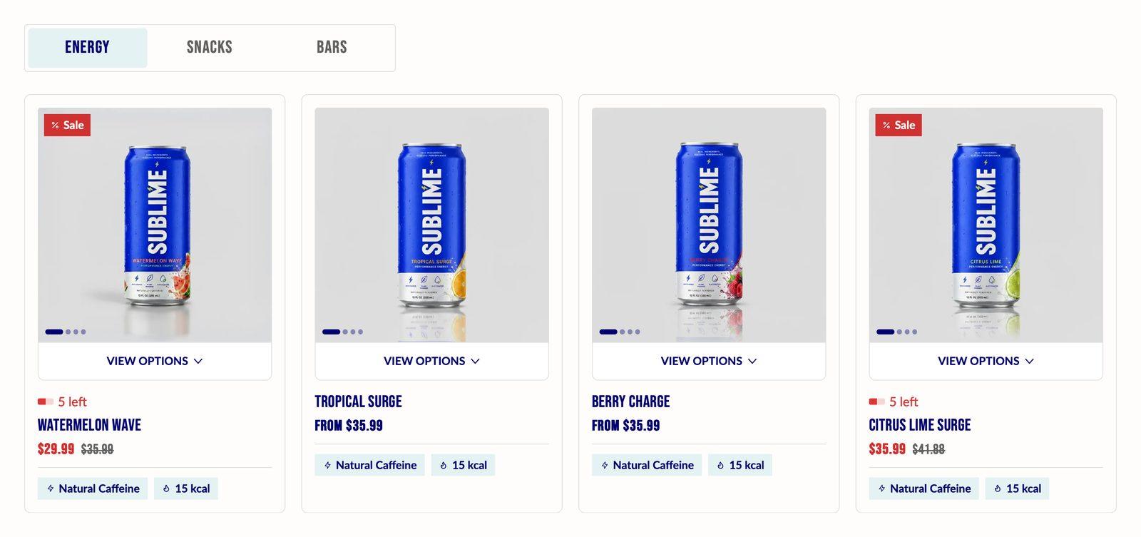
At a glance: Add it to any page with Add section. Holds up to 5 blocks.
Good for
- Bestsellers and New arrivals tabs on the homepage
- A hand-picked row of products for a campaign
- Leading a row of products with an image promo card
How to add the section
- From your Shopify admin, go to Online Store → Themes and click Customize on Sublime.
- Open the page you want to edit from the dropdown at the top of the editor.
- In the left sidebar, click Add section.
- Search for Featured collection and select it.
- Drag it into position, adjust the settings below, and click Save.
Section settings
Content
| Caption | Small label above the heading, used for eyebrow text like a category or a date. |
| Heading | The section title. Leave it empty to hide the heading row entirely and let the content start at the top. |
| Heading size | Picks one of the heading sizes defined in Theme settings → Typography, so headings stay consistent across sections instead of being sized one by one.
Choose Default (default), H1, H2, H3, H4, H5 or H6. |
| Description | Body copy shown under the heading. Supports bold, italic and links. |
| Text alignment | Aligns the heading and body text left, center or right.
Default: Left. |
| Button label | Text on the button. Leave it empty to hide the button. Two or three words reads best. |
| Button link | Where the button goes. A button with no link is not shown. |
| Open link in new tab | Opens the link in a new browser tab. Best kept for links that leave your store, so shoppers don't lose their place.
Off by default. |
| Button style | Picks one of the button styles defined in Theme settings → Buttons: primary, secondary or tertiary.
Choose Primary (default), Secondary or Tertiary. |
| Button icon | Optional icon shown after the button label.
Choose None (default), Arrow left, Arrow right, Arrow up, Arrow down, Chevron left, Chevron right, Chevron up, Chevron down, Arrow up right, Plus, Minus, Cross, Check, Play, Cart, Shopping cart, Search, Link, Download, Envelope, Home, Edit, User, Login, Heart, Chat, Filter, Trash, Share, Phone, Map pin or Eye. |
Layout
| Products to show | Maximum number of products shown in the section.
Adjustable from 3 to 25 (default 8). |
| Desktop columns | How many items sit side by side on desktop.
Choose 3, 4 (default) or 5. |
| Enable carousel on desktop | Turns the row into a swipeable carousel on desktop instead of wrapping items onto a second line.
On by default. |
| Enable carousel on mobile | Turns the row into a swipeable carousel on mobile.
Off by default. |
| Mobile columns | How many items sit side by side on mobile.
Choose 1 or 2 (default). Only appears when Enable carousel on mobile is off. |
Appearance
| Color scheme | Sets the background, text, border and button colors for the section. Schemes are defined once in Theme settings → Colors and reused everywhere, so changing a scheme updates every section using it. |
| Card color scheme | Color scheme applied to product cards in this section only, overriding the card scheme set in Theme settings → Product card. |
Spacing
Top and bottom spacing for desktop, with optional separate values for mobile. These are the same controls on every section. See Settings every section shares.
Blocks
Blocks are the individual pieces inside the section. In the sidebar, click Add block under the section to add one, and drag blocks to reorder them. The order in the sidebar is the order on the page.
Collection block
| Tab label | The name on this collection's tab. Keep it to one or two words so the tabs fit on mobile.
Leave blank to use the default tab name. |
| Collection | The collection this section pulls products from. |
| Products | Choose the products to show, and in what order.
Used only when no collection is selected. |
Tab icon
| Icon | Upload your own icon image.
Choose None (default), Store, Phone, Heart, User, Check, Check circle, Star, Lab, Info, Truck, Free shipping, Ruler, Returning, Return, Secure, Credit card, Gift, Tag, Discount, Map pin, Package, Clock, Wallet, Coupon, Award, Barcode, Diamond, Leaf, Apple, Gluten free, Gluten, Vegan, Dairy, Dairy free, No added sugar, Protein, Droplet, Droplet free, Bolt, Moon, Brain, Recycle, Envelope, Chat, Sparkle, Flame, Recurring, Lock, Globe, Calendar, Nut off, Sprout, Arrow right, Arrow up right, Arrow left, Chevron right, Chevron down, Plus, Minus, Cross, Play, Cart, Shopping cart, Search, Link, Download, Home, Hamburger, Edit, Login, Error, Arrow up, Chevron left, Chevron up, Arrow down, Filter, Trash, Share, Eye, Sound on, Sound off, Expand, Copy, Question, Warning, Sticky note, Notification, Swap, List, Grid, Logout or Dot. |
| Custom icon | Upload your own icon image.
Overrides the selected icon above. |
Promo card
| Show promo card | Adds an image card as the first item in this tab, ahead of the products. It takes the place of one product, so the tab shows one product fewer.
Off by default. |
| Image | Background of the promo card. It's cropped to fill a card the same height as the product cards, so a portrait image matching your product image shape works best.
Only appears when Show promo card is on. |
| Overlay opacity | Darkens the promo image so the heading and button stay readable. Higher values mean a darker image.
Adjustable from 0% to 100% (default 40%). Only appears when Show promo card is on. |
| Heading | Text shown on the promo card.
Only appears when Show promo card is on. |
| Heading size | Size of the promo card heading, from the sizes in Theme settings → Typography.
Choose Default (default), H1, H2, H3, H4, H5 or H6. Only appears when Show promo card is on. |
| Button label | Text on the promo card's button. Leave it empty to hide the button.
Only appears when Show promo card is on. |
| Button link | Where the promo card's button goes.
Only appears when Show promo card is on. |
| Open link in new tab | Opens the promo button's link in a new browser tab.
Off by default. Only appears when Show promo card is on. |
| Button style | Which of the button styles from Theme settings → Buttons the promo button uses.
Choose Primary, Secondary (default) or Tertiary. Only appears when Show promo card is on. |
| Button icon | Optional icon shown after the promo button's label.
Choose None (default), Arrow left, Arrow right, Arrow up, Arrow down, Chevron left, Chevron right, Chevron up, Chevron down, Arrow up right, Plus, Minus, Cross, Check, Play, Cart, Shopping cart, Search, Link, Download, Envelope, Home, Edit, User, Login, Heart, Chat, Filter, Trash, Share, Phone, Map pin or Eye. Only appears when Show promo card is on. |
Layout
| Text alignment | Aligns the promo card's heading and button left, center or right.
Default: Left. Only appears when Show promo card is on. |
| Text vertical alignment | Places the heading and button at the top, middle or bottom of the promo card.
Choose Top, Center or Bottom (default). Only appears when Show promo card is on. |
Badge
| Show badge | Adds a small label to a top corner of the promo card, such as "New" or "Limited". It only appears once you enter badge text.
Off by default. Only appears when Show promo card is on. |
| Text | The words on the badge. Keep it to one or two words.
Only appears when Show promo card is on and Show badge is on. |
| Icon | Optional icon before the badge text. A custom icon image, if you upload one, is used instead.
Choose None, Store, Phone, Heart, User, Check, Check circle, Star (default), Lab, Info, Truck, Free shipping, Ruler, Returning, Return, Secure, Credit card, Gift, Tag, Discount, Map pin, Package, Clock, Wallet, Coupon, Award, Barcode, Diamond, Leaf, Apple, Gluten free, Gluten, Vegan, Dairy, Dairy free, No added sugar, Protein, Droplet, Droplet free, Bolt, Moon, Brain, Recycle, Envelope, Chat, Sparkle, Flame, Recurring, Lock, Globe, Calendar, Nut off, Sprout, Arrow right, Arrow up right, Arrow left, Chevron right, Chevron down, Plus, Minus, Cross, Play, Cart, Shopping cart, Search, Link, Download, Home, Hamburger, Edit, Login, Error, Arrow up, Chevron left, Chevron up, Arrow down, Filter, Trash, Share, Eye, Sound on, Sound off, Expand, Copy, Question, Warning, Sticky note, Notification, Swap, List, Grid or Logout. Only appears when Show promo card is on and Show badge is on. |
| Custom icon | Overrides the selected icon above.
Only appears when Show promo card is on and Show badge is on. |
| Alignment | Whether the badge sits in the top-left or top-right corner of the promo card.
Choose Left (default) or Right. Only appears when Show promo card is on and Show badge is on. |
Appearance
| Card color scheme | Colors for the promo card's text, button and badge, separate from the section and product cards.
Only appears when Show promo card is on. |
Tips
- Name tabs in one or two words. Tabs that fit on one line on mobile are easier to tap.
- Use the promo card to set the scene. An image of the collection in use, placed before the products, makes the row feel curated.
- Pick products by hand for campaigns. Leave Collection empty and use Products to set your own order.
Troubleshooting
The tabs aren't showing
Tabs only appear once the section has two or more collection blocks. With one block the products show without a tab bar.
I picked products but the tab shows a whole collection
When a block has a Collection selected, the collection wins. Clear the collection to use your product list.
The tab shows one product fewer than I set
The promo card takes the place of one product. Raise Products to show by one to make up for it.