
Featured product
One product with its full buying interface (media, variants, price and add to cart) on any page. Built from the same blocks as the product page.
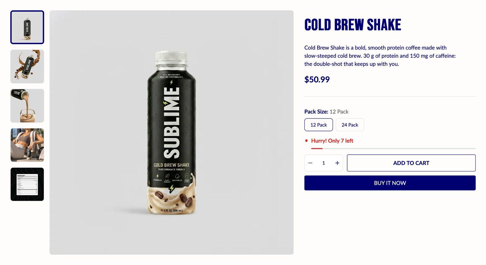
At a glance: Add it to any page with Add section.
Good for
- Selling a hero product straight from the homepage
- A buyable product on a landing or campaign page
- Showing a product's variants and price inside a story page
How to add the section
- From your Shopify admin, go to Online Store → Themes and click Customize on Sublime.
- Open the page you want to edit from the dropdown at the top of the editor.
- In the left sidebar, click Add section.
- Search for Featured product and select it.
- Drag it into position, adjust the settings below, and click Save.
Section settings
Content
| Product | The product this block shows. |
Gallery
| Desktop layout | Arrangement on desktop.
Choose Bottom thumbnail (default), Left thumbnail, Right thumbnail, Vertical stack or Horizontal scroll. |
| Mobile layout | Arrangement on mobile.
Choose Bottom thumbnail (default), Vertical stack or Horizontal scroll. |
| Desktop media position | Which side of the text the media sits on.
Choose Left (default) or Right. |
Image
| Desktop image ratio | Image crop shape on desktop.
Choose Portrait (3:4), Landscape (4:3), Square (1:1) (default) or Adapt to image. |
| Mobile image ratio | Image crop shape on mobile.
Choose Portrait (3:4), Landscape (4:3), Square (1:1) (default) or Adapt to image. |
| Image fit | Cover fills the frame and crops the overflow; Contain fits the whole image inside the frame and may leave space at the edges.
Applies to desktop and mobile. Choose Cover (default) or Contain. |
| Image background color | Fills the space around an image when it is fitted rather than cropped. It's most visible with product shots on transparent backgrounds.
Only appears when Image fit is Contain. |
Thumbnail image
| Image ratio | Crop shape of the gallery thumbnails.
Choose Portrait (3:4), Landscape (4:3), Square (1:1) (default) or Adapt to image. |
| Image fit | Whether thumbnails are cropped to fill their frame or fitted inside it.
Choose Cover (default) or Contain. |
| Image background color | Fills the space around fitted thumbnail images.
Only appears when Image fit is Contain. |
Badges
| Enable badges | Shows sale and stock badges on product cards. Badge text and colors are set in Theme settings → Product badges.
Off by default. |
Features
| Enable image zoom | Magnifies the image where the shopper hovers over it.
Off by default. |
| Enable lightbox | Opens images full screen when clicked.
Off by default. |
| Enable video autoplay | Starts the video as soon as it is in view. Autoplaying video is always muted, because browsers block sound without a click.
Off by default. |
| Enable video looping | Restarts the video when it reaches the end.
Off by default. |
Appearance
| Color scheme | Sets the background, text, border and button colors for the section. Schemes are defined once in Theme settings → Colors and reused everywhere, so changing a scheme updates every section using it. |
Spacing
Top and bottom spacing for desktop, with optional separate values for mobile. These are the same controls on every section. See Settings every section shares.
Blocks
Blocks are the individual pieces inside the section. In the sidebar, click Add block under the section to add one, and drag blocks to reorder them. The order in the sidebar is the order on the page.
Title block
| Heading | The section title. Leave it empty to hide the heading row entirely and let the content start at the top. |
| Heading size | Picks one of the heading sizes defined in Theme settings → Typography, so headings stay consistent across sections instead of being sized one by one.
Choose Default (default), H1, H2, H3, H4, H5 or H6. |
Product metadata block
| Show vendor | Shows the product's vendor.
On by default. |
| Show SKU | Shows the selected variant's SKU.
On by default. |
| Show barcode | Shows the selected variant's barcode.
Off by default. |
Rating block
Install a product reviews app to show ratings here. Its widget renders automatically.
| Additional text | Text shown beside the rating, such as the review count or a link to reviews. |
Price block
| Show installment info | Shows the Shop Pay installment breakdown.
Off by default. |
| Show offer text | Shows next to the compare-at price.
Off by default. |
| Discount format | How a sale is shown next to the price: as an amount saved or a percentage.
Choose Percentage off (default), Saved amount or On sale. Only appears when Show offer text is on. |
Variant picker block
Layout
| Selector type | How variant options are picked: buttons shown side by side, or a dropdown. Buttons are faster to use; dropdowns save space when there are many options.
Choose Button (default) or Dropdown. |
| Show swatches | Shows color swatches on the product card. Swatches are configured in Theme settings → Color swatches.
On by default. |
| Desktop swatch size | Size of color swatches on desktop.
Adjustable from 24px to 80px (default 40px). Only appears when Show swatches is on. |
| Mobile swatch size | Size of color swatches on mobile.
Adjustable from 20px to 80px (default 36px). Only appears when Show swatches is on. |
Size guide
| Show size guide link | Adds a size guide link beside the variant picker.
Off by default. |
| Label | Text of the size guide link.
Only appears when Show size guide link is on. |
| Show next to option | Enter the option name exactly as it appears (e.g. Size, Width).
Only appears when Show size guide link is on. |
| Size guide page | The page the size guide link opens. |
| Size chart image | Use a size chart image instead of a page. When set, it replaces the page content.
Only appears when Show size guide link is on. |
Stock alert block
Displays only the "In stock" label when inventory is above the chosen threshold.
| Low stock threshold | Shows "Only X left!" when stock drops below this number.
Adjustable from 1 to 100 (default 10). |
| Show stock meter | Shows a progress bar when stock is running low.
Off by default. |
| Stock meter max quantity | Inventory quantity that fills the stock meter to 100%.
Default: 100. Only appears when Show stock meter is on. |
| Show stock count | Shows the exact number left in stock rather than just in or out of stock.
Off by default. |
Appearance
| In stock color | Color of the stock indicator when stock is healthy.
Default: #00ff66. |
| Low stock color | Color of the stock indicator once stock falls below the low-stock threshold.
Default: #eb3323. |
| Out of stock color | Color of the stock indicator when the variant is sold out.
Default: #787878. |
Buy buttons block
| Hide quantity selector | Removes the quantity picker, so each add to cart adds one.
Off by default. |
| Show dynamic checkout buttons | Adds a checkout button under Add to cart that takes shoppers straight to checkout with this product, skipping the cart. Shopify picks which button to show: a Buy it now button, or the shopper's preferred express payment like Shop Pay, PayPal, Apple Pay or Google Pay, depending on the payment methods your store accepts and the shopper's device.
While it's shown, Add to cart uses your secondary button style so the checkout button stands out as the main action. When this is off or the variant is sold out, Add to cart uses the primary style. On by default. |
| Enable gift card recipient form | Lets shoppers send a gift card straight to someone else. On gift card products, an I want to send this as a gift checkbox appears above the quantity selector and buttons. Ticking it opens fields for the recipient's email, their name, a message of up to 200 characters and a Send on date up to 90 days ahead.
Shopify emails the gift card to the recipient on that date, or right after the order when no date is picked. Only the email is required. Other products don't show the form. Off by default. |
Gift wrap block
Allow customers to add gift wrapping to their product. The gift wrap product is bundled with the main product in a single add-to-cart request.
The gift product should be unlisted and inventory tracking must be disabled.
| Label | The checkbox text. The gift wrap product's price is added after it automatically, for example "Gift wrap this product [$5.00]". |
| Gift wrap product | The product added to the cart when a shopper ticks the gift wrap checkbox. Its price appears next to the label. The block stays hidden on the storefront until you pick one. |
Appearance
| Icon color | Color of the gift icon beside the checkbox.
Default: #000000. |
| Text color | Color of the block's text. In the Highlights block, the icons follow this color too; leave it empty there to use the color scheme's text color.
Default: #000000. |
Custom Liquid block
| Liquid | Add app snippets or other Liquid code to create advanced customizations. |
Tips
- Only include the blocks that help someone decide. On a landing page, title, price, variants and add to cart are often enough.
- Turn on the lightbox for detailed products. Shoppers can then open images full screen without leaving the page.
Troubleshooting
The section shows a sample product
No product is selected yet. Choose one under Product. Until then the section shows sample content so you can see the layout.
Ratings don't appear
The rating block needs a product reviews app that saves ratings to your products. Install and set up the app, and ratings appear automatically.