
Product comparison
A table comparing products row by row: price, stock, variants, ratings, SKU and metafields. Each row is a block, so you choose what is compared.
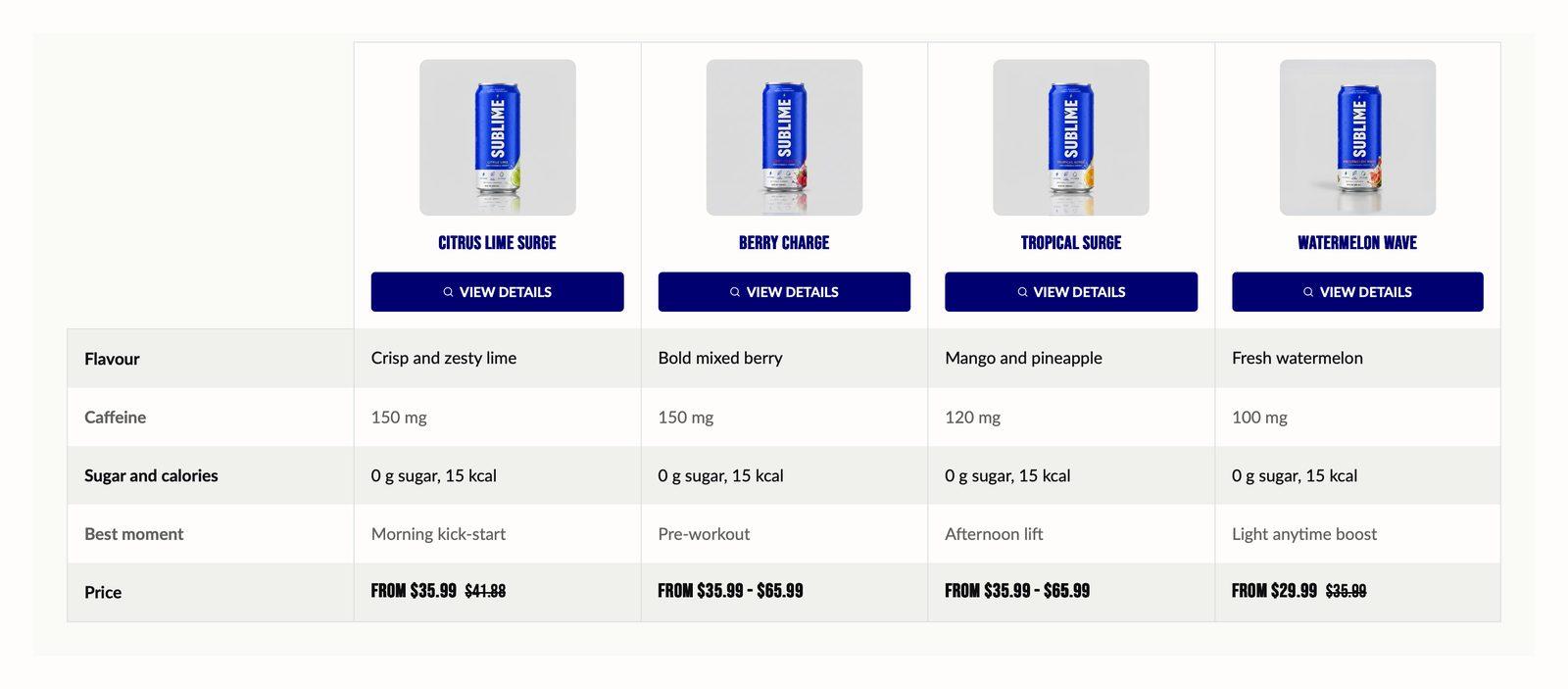
At a glance: Add it to any page with Add section.
Good for
- Helping shoppers choose between two to four similar products
- Spec tables for products with measurable differences
- Pointing shoppers to your recommended option with the spotlight column
Show product data with a metafield row
- In your Shopify admin, go to Settings → Custom data → Products and click Add definition.
- Name it (for example Watts) and choose the type Single line text. Single line text (list of values) and Metaobject references also work. Other types show an empty cell.
- Note the definition's namespace and key, such as
custom.watts. - Open each product you're comparing and fill in the value under Metafields.
- In the theme editor, add a Metafield row to the section and enter the key, such as
custom.watts. For a variant metafield, start it withvariant., as invariant.custom.material. The selected or first available variant is used.
How to add the section
- From your Shopify admin, go to Online Store → Themes and click Customize on Sublime.
- Open the page you want to edit from the dropdown at the top of the editor.
- In the left sidebar, click Add section.
- Search for Product comparison and select it.
- Drag it into position, adjust the settings below, and click Save.
Section settings
Content
| Caption | Small label above the heading, used for eyebrow text like a category or a date. |
| Heading | The section title. Leave it empty to hide the heading row entirely and let the content start at the top. |
| Heading size | Picks one of the heading sizes defined in Theme settings → Typography, so headings stay consistent across sections instead of being sized one by one.
Choose Default (default), H1, H2, H3, H4, H5 or H6. |
| Description | Body copy shown under the heading. Supports bold, italic and links. |
| Text alignment | Aligns the heading and body text left, center or right.
Default: Center. |
| Button label | Text on the button. Leave it empty to hide the button. Two or three words reads best. |
| Button link | Where the button goes. A button with no link is not shown. |
| Open link in new tab | Opens the link in a new browser tab. Best kept for links that leave your store, so shoppers don't lose their place.
Off by default. |
| Button style | Picks one of the button styles defined in Theme settings → Buttons: primary, secondary or tertiary.
Choose Primary, Secondary (default) or Tertiary. |
| Button icon | Optional icon shown after the button label.
Choose None (default), Arrow left, Arrow right, Arrow up, Arrow down, Chevron left, Chevron right, Chevron up, Chevron down, Arrow up right, Plus, Minus, Cross, Check, Play, Cart, Shopping cart, Search, Link, Download, Envelope, Home, Edit, User, Login, Heart, Chat, Filter, Trash, Share, Phone, Map pin or Eye. |
| Show content inline | Places the heading, text and button beside the table instead of above it, on tablet and desktop. With four products, the table scrolls sideways to make room. On mobile the heading always sits above.
Off by default. |
Product table
| Products | Choose the products to show, and in what order. |
| Show product actions | Shows a button under each product in the table. Products with only one variant get an Add to cart button; products with options link to their page so shoppers can choose first.
On by default. |
| Show table headings | Shows the row names (Price, Stock, and so on) down the left of the table. Turn it off when the rows speak for themselves. Screen readers still announce the names.
On by default. |
| Enable spotlight product | The first product you select becomes the spotlight product.
Off by default. |
| Spotlight background color | Background of the spotlight column, the first product in the table, which is highlighted as your recommendation.
Default: #C6F34A. Only appears when Enable spotlight product is on. |
| Spotlight text color | Text color in the spotlight column. Pick one that contrasts with the spotlight background.
Default: #0D0D0F. Only appears when Enable spotlight product is on. |
Appearance
| Table color scheme | Colors for the table itself, so it can sit apart from the section background. |
| Alternate row color | Background color of every other row, for easier scanning.
Default: #F0F0ED. |
| Alternate row text color | Text color on alternating rows.
Default: #0D0D0F. |
| Color scheme | Sets the background, text, border and button colors for the section. Schemes are defined once in Theme settings → Colors and reused everywhere, so changing a scheme updates every section using it. |
Spacing
Top and bottom spacing for desktop, with optional separate values for mobile. These are the same controls on every section. See Settings every section shares.
Blocks
Blocks are the individual pieces inside the section. In the sidebar, click Add block under the section to add one, and drag blocks to reorder them. The order in the sidebar is the order on the page.
Pricing block
You can add up to 1 of these per section.
| Row label | Label for this row. |
Stock availability block
You can add up to 1 of these per section.
| Row label | Label for this row. |
Description block
You can add up to 1 of these per section.
| Row label | Label for this row. |
| Truncate description | Shortens each product's description to a set length and adds a Read more link, so one long description doesn't stretch the whole table.
Off by default. |
| Truncate limit | How many characters of the description show before it's cut off.
Adjustable from 100 to 300 (default 120). Only appears when Truncate description is on. |
Variants block
You can add up to 1 of these per section.
| Row label | Label for this row. |
| Show color swatches | Shows color swatches on the product card. Swatches are configured in Theme settings → Color swatches.
Enabling this will override the variant text content. Off by default. |
Ratings block
You can add up to 1 of these per section.
| Row label | Label for this row. |
Vendor block
You can add up to 1 of these per section.
| Row label | Label for this row. |
Barcode block
You can add up to 1 of these per section.
| Row label | Label for this row. |
SKU block
You can add up to 1 of these per section.
| Row label | Label for this row. |
Table row block
Heading column
| Row label | Label for this row. |
Column 1–4
Each of the 4 columns has the same settings, set separately for each one.
| Column 1–4 | What this row says for the product in that column. Column 1 is the first product you picked, column 2 the second, and so on. |
| Icon | A tick or cross shown in this cell, next to any text. Choose None for text only. With no text and None, the cell is left empty.
Choose Tick (default), Cross or None. |
Metafield block
| Row label | Label for this row. |
| Metafield key | Enter a metafield namespace.key path, like "custom.watts" or "variant.custom.material". |
Tips
- Compare three products at most on mobile. The table scrolls sideways on small screens, and a fourth column is easy to miss.
- Put the deciding rows first. Price and the one or two specs that really separate the products belong at the top.
- Use ticks and crosses for yes/no features. They're quicker to scan than words in a text row.
Troubleshooting
A metafield row is empty
Check that the key matches exactly (namespace.key), that the product has a value, and that the metafield is a single line text, a list of single line text, or a metaobject reference.
The ratings row shows no rating
Ratings come from a product reviews app that saves ratings to your products. Without one, the row shows no rating.
The table shows sample products
No products are selected. Pick up to four in Products. Text row columns follow the same order.