
Shoppable image
A lifestyle photo with clickable pins. A product pin opens a small buy card; an info pin shows a note.
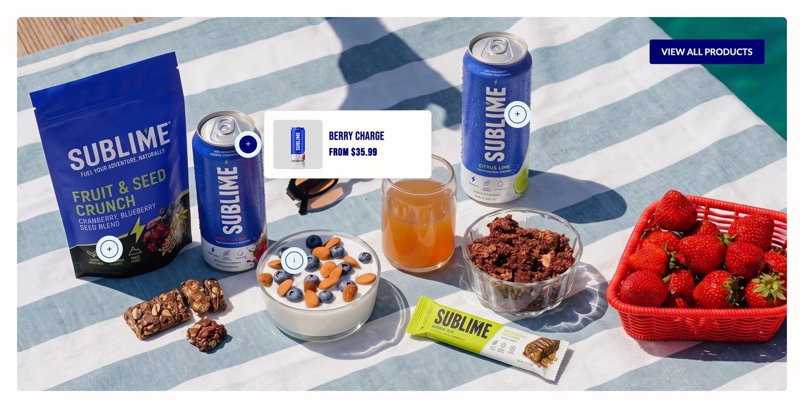
At a glance: Add it to any page with Add section.
Good for
- A styled room or outfit with each product tagged
- A lookbook photo that shoppers can buy from directly
- Adding notes about materials or details with info pins
How to add the section
- From your Shopify admin, go to Online Store → Themes and click Customize on Sublime.
- Open the page you want to edit from the dropdown at the top of the editor.
- In the left sidebar, click Add section.
- Search for Shoppable image and select it.
- Drag it into position, adjust the settings below, and click Save.
Section settings
Layout
| Enable full width | Stretches the section edge to edge instead of holding it inside the page container.
Off by default. |
| Display all products in overlay | Shows associated products in a drawer when customers click "View all products".
Off by default. |
| Button style | Picks one of the button styles defined in Theme settings → Buttons: primary, secondary or tertiary.
Choose Primary (default), Secondary or Tertiary. |
| Desktop button position | Which corner of the image the View all products button sits in on desktop. The button only appears when Display all products in overlay is on.
Choose Top left (default), Top right, Bottom left, Bottom center or Bottom right. |
| Mobile button position | Which corner of the image the View all products button sits in on mobile.
Choose Top left (default), Top right, Bottom left, Bottom center or Bottom right. |
Image
| Desktop image | Background image used on desktop.
2880 x 1280px (large) .jpg recommended. |
| Desktop image size | Image size on desktop.
Choose Small, Medium (default), Large, Full screen or Adapt to image. |
| Mobile image | A separate image used on mobile. Leave empty to reuse the desktop image.
800 x 1000px .jpg recommended. |
| Mobile image size | How tall the image is on mobile.
Choose Small, Medium (default), Large, Full screen or Adapt to image. |
Text sizes
| Item heading size | Heading size for each item, from the sizes in Theme settings → Typography.
Choose Default (default), H1, H2, H3, H4, H5 or H6. |
Appearance
| Color scheme | Sets the background, text, border and button colors for the section. Schemes are defined once in Theme settings → Colors and reused everywhere, so changing a scheme updates every section using it. |
Spacing
Top and bottom spacing for desktop, with optional separate values for mobile. These are the same controls on every section. See Settings every section shares.
Blocks
Blocks are the individual pieces inside the section. In the sidebar, click Add block under the section to add one, and drag blocks to reorder them. The order in the sidebar is the order on the page.
Product block
| Product | The product this block shows. |
Desktop hotspot
| Horizontal position | Horizontal position as a percentage across the image, from the left.
Adjustable from 0% to 100% (default 50%). |
| Vertical position | Vertical position as a percentage down the image, from the top.
Adjustable from 0% to 100% (default 50%). |
Mobile hotspot
| Horizontal position | Horizontal position on mobile.
Adjustable from 0% to 100% (default 50%). |
| Vertical position | Vertical position on mobile.
Adjustable from 0% to 100% (default 50%). |
Info block
Content
| Heading | The section title. Leave it empty to hide the heading row entirely and let the content start at the top. |
| Description | Body copy shown under the heading. Supports bold, italic and links. |
Desktop hotspot
| Horizontal position | Horizontal position as a percentage across the image, from the left.
Adjustable from 0% to 100% (default 50%). |
| Vertical position | Vertical position as a percentage down the image, from the top.
Adjustable from 0% to 100% (default 50%). |
Mobile hotspot
| Horizontal position | Horizontal position on mobile.
Adjustable from 0% to 100% (default 50%). |
| Vertical position | Vertical position on mobile.
Adjustable from 0% to 100% (default 50%). |
Tips
- Leave space around pins. Place pins over the products themselves, away from the edges, so the pop-up card has room to open.
- Set mobile pin positions separately. A mobile crop moves things around, so check each pin on a phone preview.
- Turn on the products overlay for busy images. The View all products button gives shoppers a list when there are many pins.
Troubleshooting
The View all products button isn't showing
Turn on Display all products in overlay. The button position settings only take effect when it's on.
My pins are in the wrong place on mobile
Each pin has its own mobile position settings. Adjust them while previewing the mobile view.