Product Quick View
The Product Quick View feature is here to make shopping easier and more convenient for your customers. It gives them a quick and detailed look at your products right from the product card, saving them time and making their browsing experience much smoother!

Follow these steps to navigate and customize the Product Quick View Drawer:

Navigation guide
- Click on the top center dropdown menu.
- Select "Products" page from the options.
- Within the Product Page, you'll find two templates: "Default Product" and "Quick View Product. - Choose "Quick View Product" specifically for customizing the quick view drawer.
- Click on "Quick View Product" to access the customization options for the entire quick view drawer.
- Save changes.
Section settings
| View Details Button | Want your customers to easily explore more about a product? Enable the "View Details" button! This button will take them directly to the full product page for a closer look. |
| Dynamic Checkout Buttons | Make shopping smooth for your customers! Turn on the Dynamic Checkout Buttons so they can quickly purchase products right from the Quick View—no extra clicks needed! |
| Hide Badges | If you prefer a cleaner look, you can choose to hide product badges (like “Sale” or “New”) when customers use the Quick View feature. |
| Desktop View Layouts |
Decide how product images show up on desktop devices:
|
| Mobile View Layouts |
Make mobile shopping just as enjoyable! Choose between:
|
| Image Ratios |
Customize how your product images appear:
|
| Outline button style | Want a sleek, modern look? This option makes your Add to Cart button an outline style—clean, minimal, and stylish! |
Quick View Blocks

| Product Title | This is where your product’s name will appear, just as it does in your store. It helps customers easily identify what they're looking at! |
| Vendor Name | Automatically shows the name of the vendor (the brand or manufacturer) for each product, giving your customers more context. |
| Rating | Want to show off how much people love your product? This displays the star rating based on reviews collected through your review app. A little social proof goes a long way! |
| Price | Shows the product's price, including any discounts you might have applied—making it clear to your customers! |
| Description | Help your customers understand more about your product with a brief description. A little info can make all the difference when they're deciding to buy! |
| Payment Installments | If applicable, this section shows options for installment payments, making it easier for customers to plan their purchases. |
| Quantity Selector | Adds a field where customers can select how many items they want to buy—great for enabling bulk purchases! |
| Inventory Status |
Show Status: Decide when you want to show the inventory status:
Low Inventory Threshold: Set a number for when stock is considered "low." For instance, if you set it to 10, customers will see a “low stock” message when there are fewer than 10 items left. Inventory Base Quantity: You can set the starting point for your inventory progress bar here. Tailor it to reflect your actual stock levels! Show Inventory Count: Want to create a little urgency? Toggle this on to show the exact number of items left (like "Only 5 left!"). Customers will love knowing how many are available! Show Status Bar: Add a visual progress bar to show stock levels at a glance, helping customers quickly see how many items are left Background Color: Pick a background color for the inventory section. Make it match your store's branding for a cohesive look! Color Settings:
|
| Variant Selector |
This feature gives your customers the power to select different options for the product, like size or color. Here’s how you can set it up: Type: Decide how your customers will choose product variants:
Show Swatches: Enable swatches to show off different colors or patterns. It helps your customers see what’s available in style! Guide Drawer : Heading: Add a friendly title for your guide, like "Size Guide," so customers know exactly what kind of info they’ll find. Option for Drawer: Specify which product option (like "size" or "color") this guide applies to—keeping everything relevant! Page: Link to a dedicated page in your Shopify store that contains the guide details, such as a size guide. This makes it super easy for customers to find what they need. Image: Upload an image, like a size chart or style guide, to illustrate your points. Visuals are always a hit! |
Line item property


Available from Flawless version 10.0
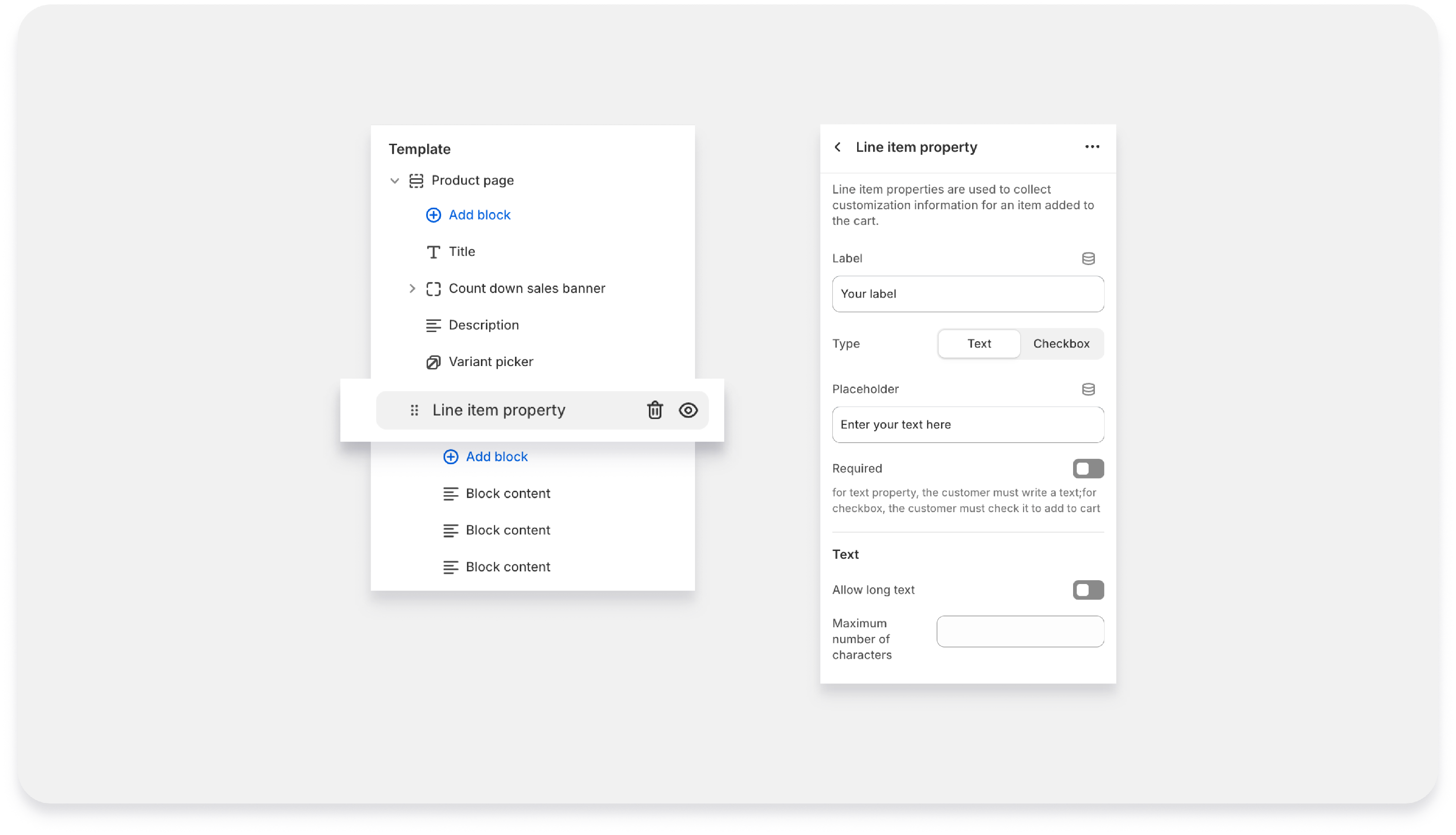
The Line Item Property block allows you to collect custom information from customers before they add a product to the cart. This is useful when you need additional details such as personalisation text, order notes, gift messages, or confirmation checkboxes.
| Label | This is the title or name of the field shown to customers on the product page. |
| Type | This setting determines the kind of input customers will provide. |
| Text |
|
| Checkbox |
Note: If Checkbox is selected, the Placeholder and Text settings will not be available because a checkbox does not require text input. |
| Placeholder |
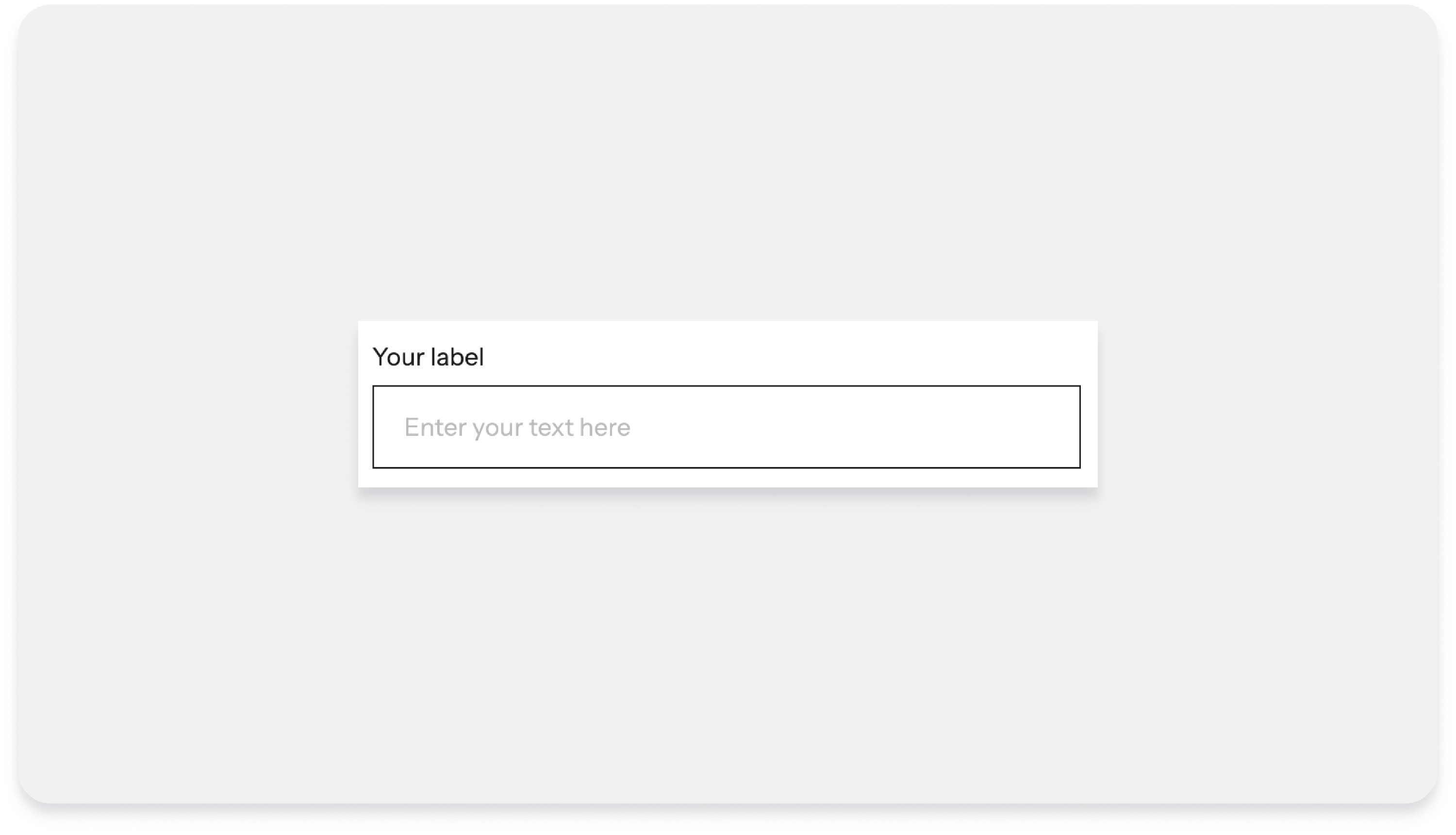
This is the example text shown inside the input field to guide customers on what to enter. Example:
The placeholder disappears when the customer begins typing. Note: This setting is only available when the Type is set to Text. |
| Required |
Enable this option if the field must be completed before the product can be added to the cart.
This is useful when the information is necessary to process the order. |
| Text Settings | These settings are available only when the Type is set to Text. |
| Allow Long Text |
When enabled, the input field allows longer or multi-line text, making it suitable for longer messages or detailed instructions. Example uses:
When disabled, the field behaves as a single-line input. |
| Maximum Number of Characters |
This allows you to limit the number of characters a customer can enter. Example:
Setting a limit helps prevent overly long entries and ensures the text fits your product customization requirements. |
Bottom Spacing (common in all blocks):
Adjust the space below the block to ensure it aligns nicely with other elements on your page, creating a well-organized layout!
