
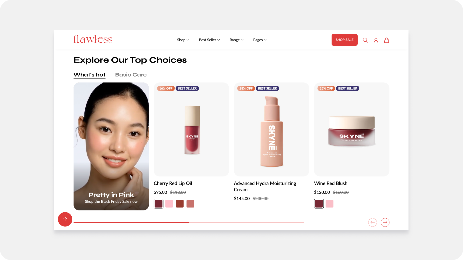
Featured collection

Use this section to display a collection of featured products. You have the option to choose a collection or select products manually. Showcase multiple collections of products with tabs to easily switch between each collection.
General settings

Layout Mode
- Carousel and grid : Choose one of the option to display products in grid or carousel.
Number of Products
- Product Count: Select the number of products to display in the Featured Collection section.
Grid Settings
- Adjust the grid column settings for different devices when the stack option is enabled:
- Desktop: Set the number of columns to display on desktop screens.
- Mobile: Set the number of columns to display on mobile screens.
Text Content
- Subheading: Add a subheading to appear above the Featured Collection section.
- Heading: Set the main heading for the Featured Collection section.
- Body Content: Provide additional information or description for the Featured Collection section using the rich text editor.
Override Product Card Colors
Available after Flawless version 12.0
Toggle ON: Unlocks the Product Card Color Scheme dropdown. You can now select a custom color scheme to instantly change the background, text, and sale/offer colors of the cards only within this section.
Link Button Settings
- Link Text: Customize the text for the link button.
- Link URL: Provide the URL for the link button. This can be a specific page on your website or an external link.
- Open Link In: Choose whether the link opens in a new tab or the same tab.
Appearance Settings
- Padding: Adjust the padding at the top and bottom of the section.
- Padding Top: Adjust the top padding.
-
Padding Bottom: Adjust the bottom padding.
- Border : Border and border positions are the options to place the border line as needed for section.
- Color Scheme: Choose a color scheme for the section from predefined options.
- Theme Settings: Customize the section based on the overall theme settings of your website.
- Custom CSS: Add custom CSS for advanced styling.
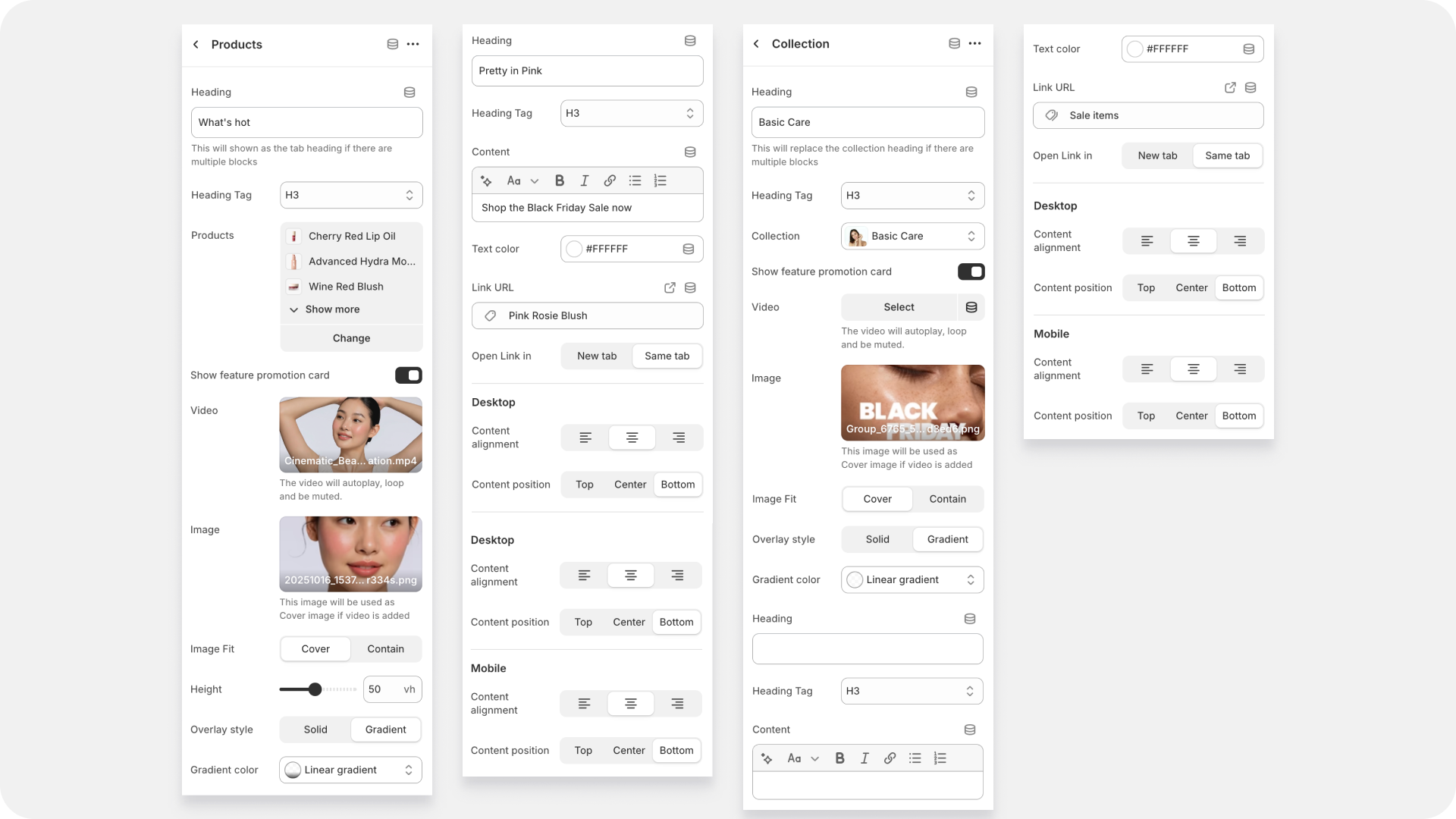
Block settings

Collection Block
The Collection Block allows you to showcase a specific collection from your store.
- Select Collection
-
Dropdown Menu: Choose the collection you want to display from the list of available collections in your store.
Heading Name
- Text Field: Enter a custom heading name for the collection. This heading will appear above the collection in the section.
-
Products Block
The Products Block allows you to manually select individual products to feature in the section.
- Select Products
-
Product Selector: Choose products to display from the list of available products in your store. You can select multiple products to create a custom collection.
Collection Name
- Text Field: Enter a name for the created collection. This name will appear above the products in the section.
-
Additionally, you can customize the product card in theme settings, enabling features like the quick view button, secondary image display, product rating, and product vendor information.
Promo Card Block
| Position in results |
Controls the card's placement. Setting this to |
IMPORTANT NOTE ON LAYOUT: This position setting only works when the Featured Collection is displayed in a GRID layout. If your collection is set to a CAROUSEL (a sliding row), the promo card will typically ignore the position and always appear at the very beginning, or as the first card.
| Video / Image | Upload your visual content. You can choose to use a compelling Image (like a high-res campaign photo) or a Video (which will usually autoplay, loop, and be muted) to instantly grab attention. |
| Image Fit | Controls how the image fills the space: Cover ensures the image fills the entire card (cropping where necessary), while Contain ensures the entire image is visible (potentially leaving white space). |
| Overlay Style | Choose the shading that sits on top of your image. Solid applies a single, uniform color filter. Gradient applies a fading color, often darker at the bottom to make text stand out. |
| Overlay Color | The color of the filter. Use a dark color (like black or dark grey) set to a low opacity for a transparent filter, which helps text pop against bright images. |
| Heading / Heading Tag | The main headline of your promotion (e.g., BLACK FRIDAY ). The Heading Tag (H3, H4, etc.) is important for SEO and structure. |
| Content | The supporting text or call-to-action (e.g., SAVINGS ARE HERE! ). Use the formatting tools (Bold, Italic) to emphasize key words |
| Text Color | Sets the color of your Heading and Content. You often need to set this to white (#FFFFFF ) to make it readable against a dark overlay. |
| Link URL / Open Link in | Where the card takes the customer! Set the specific collection page or product page here. You can choose to open it in the same window or a new tab. |
We've added a Height setting to give you precise control over the vertical size of your Promo Card on phones.
Please Note: This height control only applies when your collection is displayed in a GRID layout and you have set the number of columns to 1 on mobile. If you use a carousel or two-column mobile grid, the height will be managed automatically by the theme to ensure the best fit.