
Featured product

The Featured Product section allows you to spotlight a single product with customizable blocks including product title, price, quantity selector, variant picker, buy button, vendor details, ratings, and custom liquid options.
Click on Featured products for the general settings

Text Content
- Subheading: Add a subheading to appear above the Featured Product section.
- Heading: Set the main heading for the Featured Product section.
Product Selection
- Select Product: Choose the specific product you want to feature from the list of available products in your store.
View Details Link
- Enable View Details Link: Option to have a "View Details" link that directs users to the product page.
Product Image Position
- Image Position: Choose the position of the product image relative to the content. Options are:
- Left
- Right
Media Size
- Image Width: Control the width the image takes proportionate to the content. This setting allows you to adjust the visual balance between the image and the text content.
Image Ratios
- Desktop Image Ratio: Set the image ratio for desktop views. Options include:
- Square
- Landscape
- Portrait
- Adapt to Image
- Mobile Image Ratio: Set the image ratio for mobile views. Options are the same as for desktop.
Image Zoom
- Enable Image Zoom: Allow users to zoom into the product image for a closer look.
Layout settings
Some settings are available after version11.0
| Thumbnails left: | Small previews appear in a neat column on the left side of the main image. |
| Thumbnails bottom |
Small previews sit horizontally right underneath the main image.
|
| Grid: | A standard layout where all images are the same size. |
| Grid with main media | Makes your first image or video extra large, with smaller images following it. |
| Grid 1x1 | Shows images one by one in a large, stacked format. Great for "storytelling" as the customer scrolls down. |
| Featured 2x2 grid (1x2): | A stylish, asymmetrical mix of large and small images that looks like a high-fashion lookbook. |
Full width : Turn this on if you want your product media to stretch from one side of the screen to the other for a truly immersive feel.
Enable parallax effect: This adds a subtle, high-tech "floating" movement to your images as you scroll perfect for catching the eye!
Gap: Adjust the space between your photos.
Mobile Media Settings
| Layout |
Simple: Shows one image at a time. Peek: Lets the next image "peek" in from the side, encouraging customers to keep swiping. |
| Pagination Style |
This is how customers navigate your photos:
|
|
|
|
Thumbnail Settings
| Thumbnail Ratio: | You can also set a fixed shape (like square or portrait) to keep everything aligned |
| Thumbnail Fit |
|
Media info

Available after version 10.1
| Show info |
|
| Media text |
|
| Background color |
|
| Desktop position: |
|
| Mobile Position |
To keep things looking tidy on narrow phone screens, we’ve simplified the choices to the left side:
|
Appearance Settings
- Padding: Adjust the padding at the top and bottom of the section.
- Padding Top: Adjust the top padding.
- Padding Bottom: Adjust the bottom padding.
- Color Scheme: Choose a color scheme for the section from predefined options.
- Theme Settings: Customize the section based on the overall theme settings of your website.
-
Custom CSS: Add custom CSS for advanced styling.
Block level settings
Featured Product Section Blocks and Settings
1. Vendor Name
- Vendor Name Display: Automatically shows the vendor name of the product.
2. Product Title
- Product Title Display: Automatically shows the title of the product.
3. Rating
- Rating Display: Automatically shows the product rating when using an app.
4. Price
- Price Display: Automatically shows the product price.

5. Description
- Description Display: Automatically shows the product description.
| Collapse Content |
Keep things tidy by hiding long info behind a clickable title.
|
| Heading |
Add a title that shows above your collapsed content.
|
| Truncate Description |
Shorten long text to keep your pages sleek. If you don’t want to collapse content but still want to keep things short, this is a great option! Choose how much of your description to show:
Shoppers can click “show More” to view the rest anytime.
|
| Don’t Truncate on Desktop |
Show the full description on bigger screens.
|
| Bottom Spacing |
Add a little breathing room below your content.
|
6. Payment Installments
- Payment Installments Display: Shows available payment installment options.
7. Quantity Selector
- Quantity Selector Display: Allows users to select the quantity of the product they wish to purchase.
- Variant Picker
| Style: |
You can choose how the variants are displayed on your product page.
|
| Show swatches: | Turn this on if you want to display color or pattern swatches instead of just the variant names. It’s a great visual way to show off your options! |
| Bottom spacing: | Use this slider to add a little bit of space below the variant picker on the page. |
Guide drawer
This is one of our favorite features! The Guide drawer lets you easily add a helpful size guide or other important information right next to your variant options. It opens up like a little drawer, so it doesn't clutter your product page. Here's how to set it up:
| Heading: | This is the text that your customers will see on the button to open the guide. A great example is "Size guide." |
| Option for drawer | This is a really important step! You need to enter the exact name of the product option you want this guide to be connected to. For example, if you sell T-shirts with an option called "Size," you would type "Size" here. That way, the guide button will appear right next to the size options. |
| Page | You can link the guide to a full page on your store! Maybe you've already created a detailed size chart page. Just click "Select" and choose the page you want to link to. |
| Image | Don't have a whole page? No problem! You can simply upload an image for your guide, like a size chart graphic. It will pop up in the drawer when a customer clicks the button. You can also explore our free image library to find one that works for you. |
9. Inventory Status
- Inventory Base Quantity: Set the base quantity for inventory.
- Low Inventory Threshold: Set the quantity threshold to trigger low inventory status.
- Display Options:
- Show only when low.
- Show always.
- Status Bar: Option to show a status bar.
- Inventory Number: Option to show inventory numbers.
- Color Settings:
- In-stock color.
- Low stock color.
10. Buy Button
- Buy Button Display: Shows the button to add the product to the cart.
- Dynamic buttons: Showcase dynamic buttons for faster checkout.
11. Pickup Availability
- Pickup Availability Display: Shows if the product is available for pickup.
12. Collapsible Text
- Heading Text: Add a heading for the collapsible text section.
- Body Content: Add body content or link it to a page.
13. Badge
- Number of Badges: Add up to 6 badges.
- Custom Icons: Replace default icons with custom ones.
- Badge Heading: Add a heading for each badge.
- Badge Content: Add additional content for each badge.
14. Share
- Share Block Display: Shows options to share the product on social media platforms.
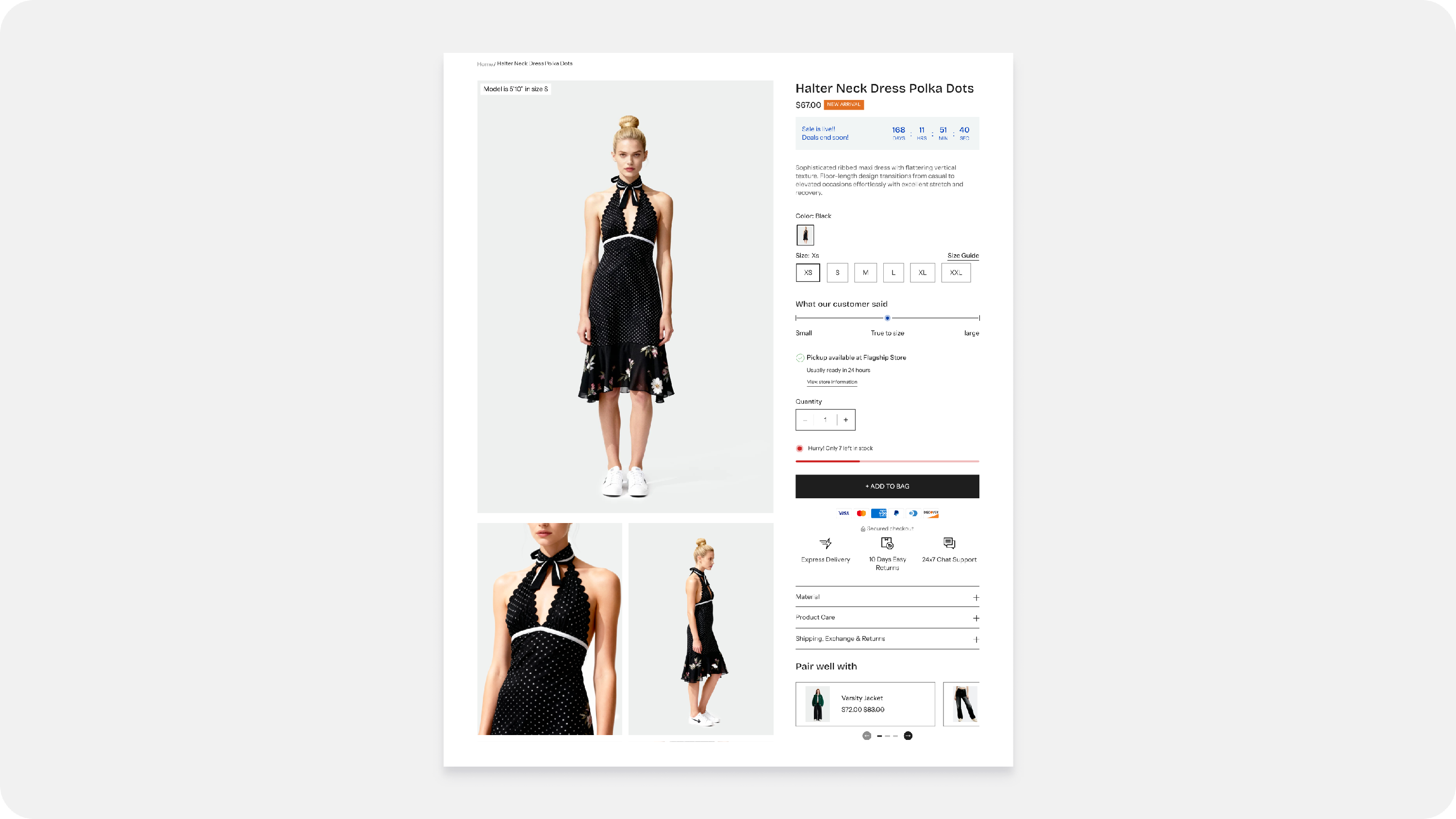
- PDP Sales Banner
Parent Block: Overall Banner Control
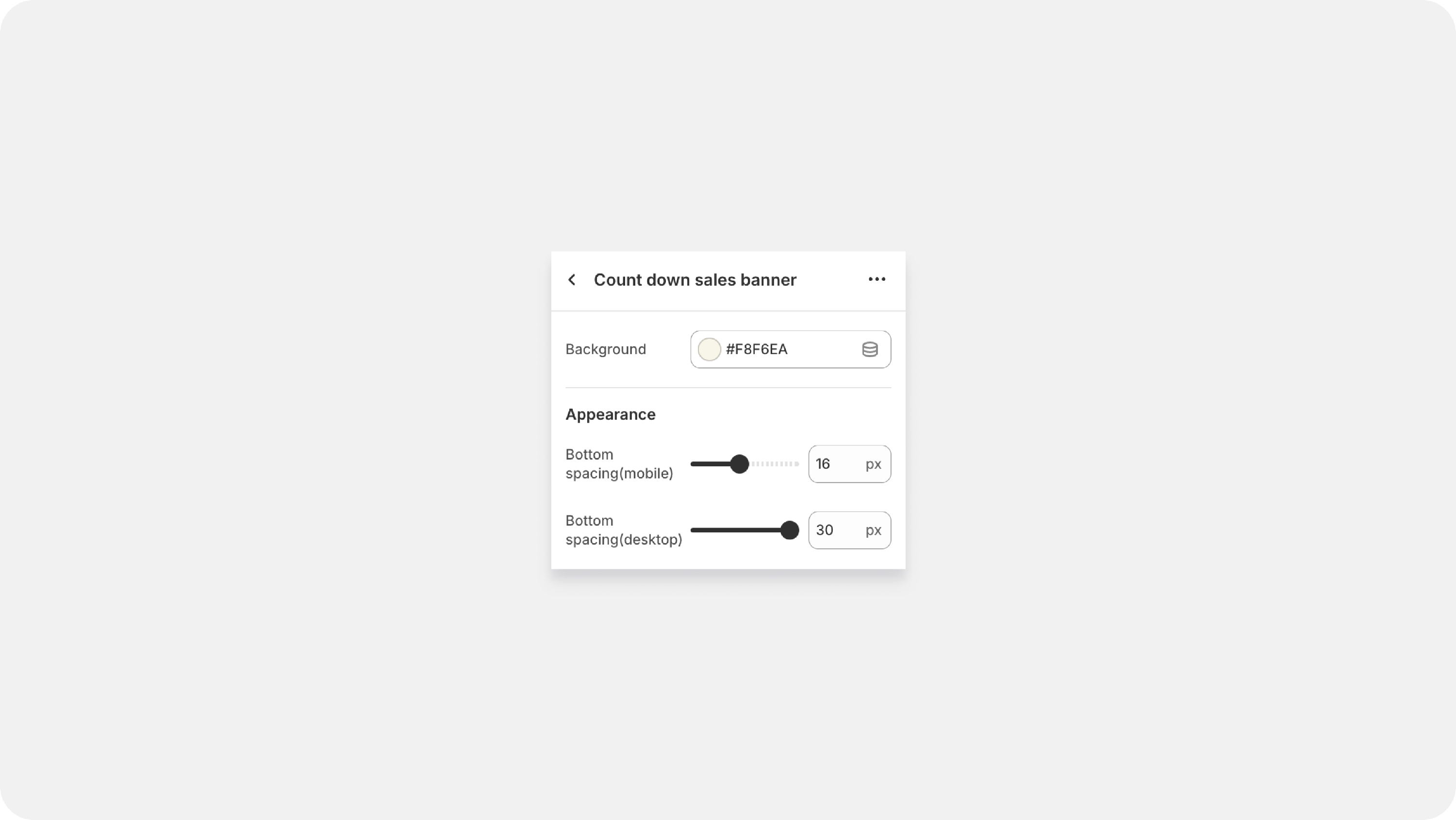
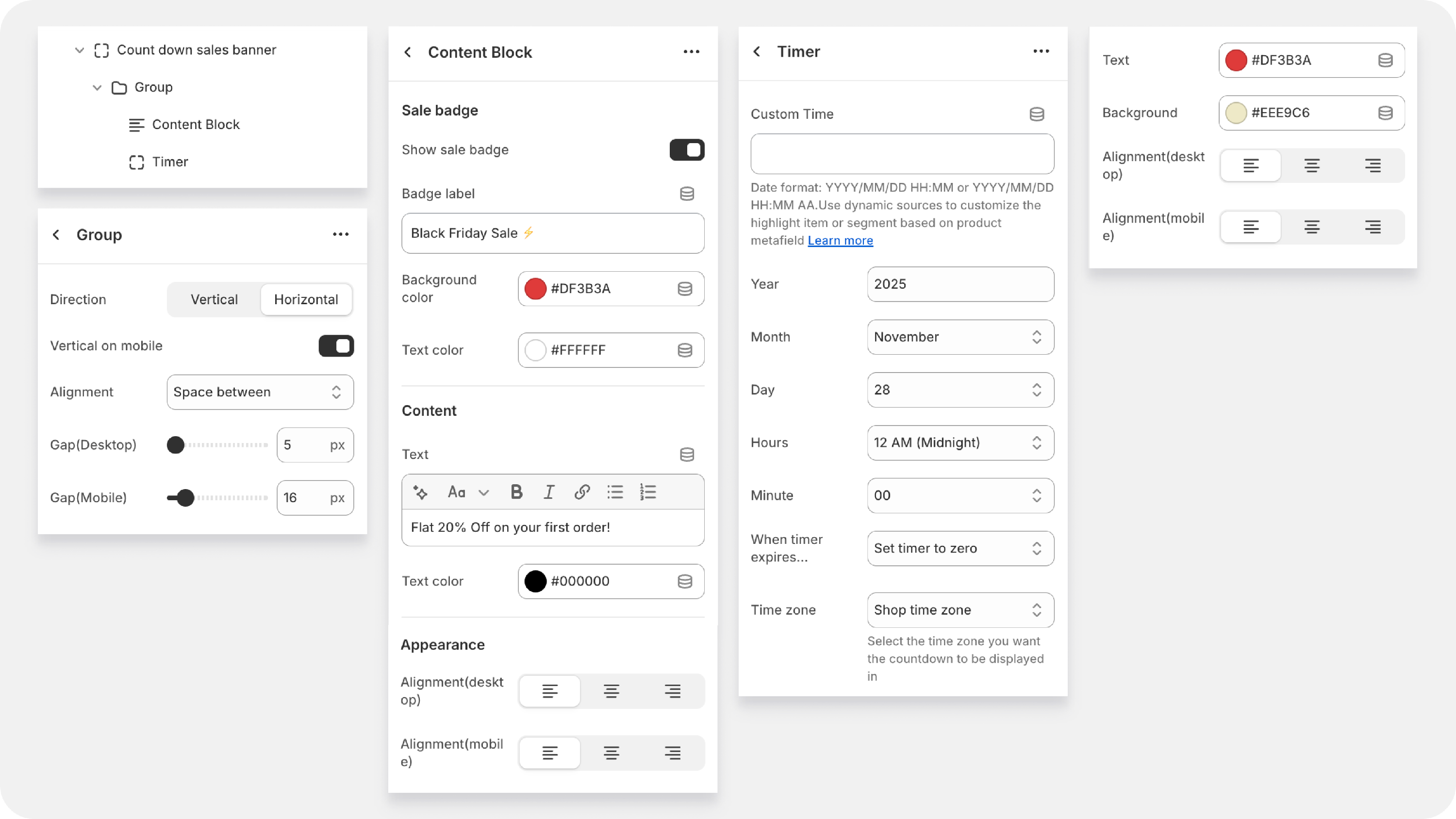
| Background | Sets the background color for the entire banner container using a color picker or a hexadecimal code (e.g., #A83636 ). |
| Bottom spacing | Controls the vertical space (padding/margin) below the banner when viewed on a mobile device. Set the value in pixels (e.g., 15 px ). |
| Bottom spacing (desktop) | Controls the vertical space (padding/margin) below the banner when viewed on a desktop or larger screen. |
Group Block: Layout and Alignment
| Direction (Vertical/Horizontal | Horizontal puts elements side-by-side (great for desktop). Vertical stacks them top-to-bottom (essential for mobile readability). |
| Vertical on Mobile | A lifesaver! If you set the group to Horizontal for desktop, you can check this box to automatically stack them vertically on phones, ensuring a clean mobile experience without clutter. |
| Gap (Desktop/Mobile) : | Controls the space between elements within this group. Use a small gap (e.g., 24 px ) to keep related items close but distinct. |
Child Blocks:
A. Content Block (Badge and Text)
| Show Sale Badge: | Toggle a small visual flag (e.g., "SALE" or "NEW") on or off. |
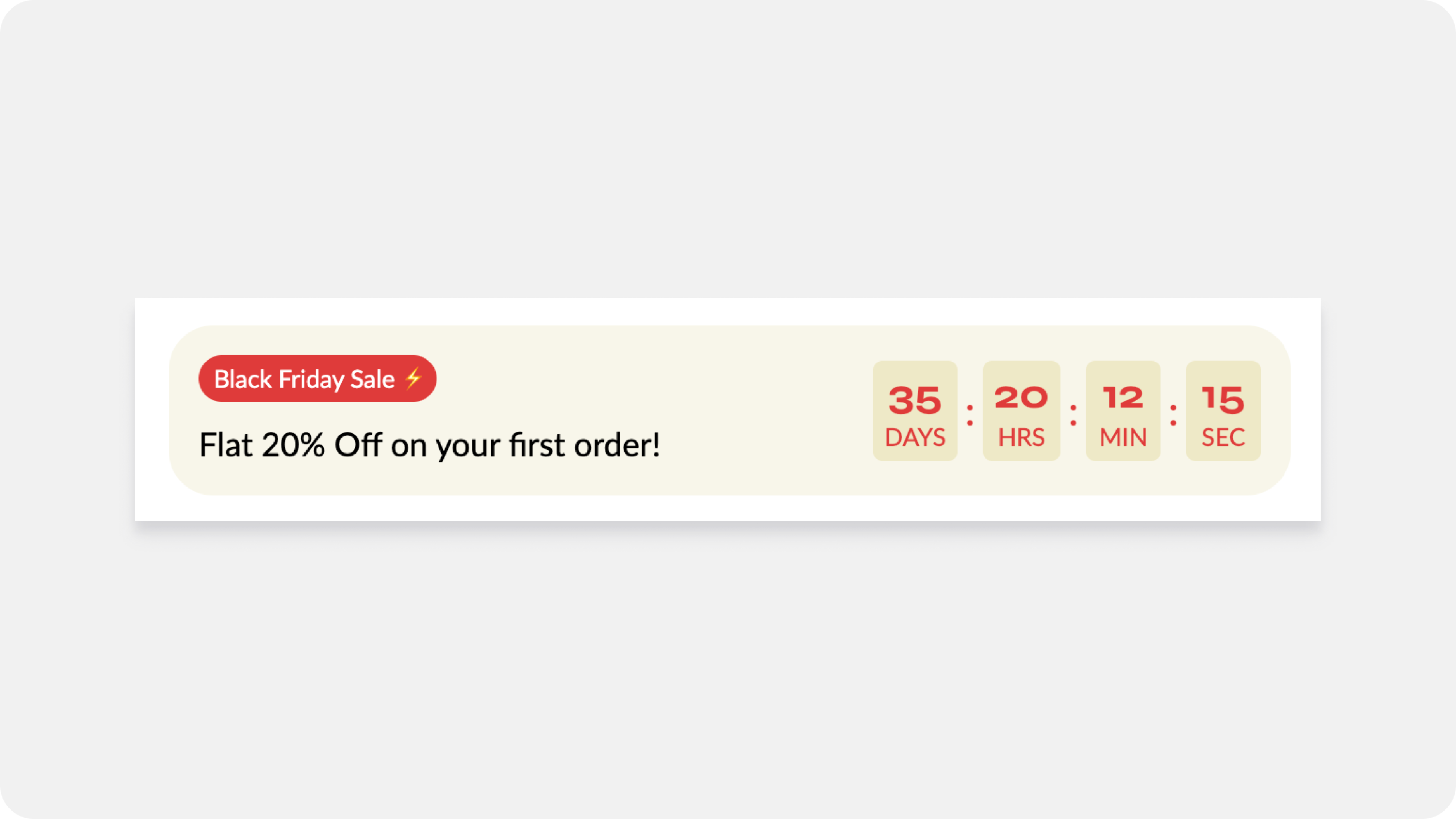
| Badge Label : | The text inside the badge (e.g., BLACK FRIDAY SALE ). |
| Background Color : | Sets the color for the badge itself (the example uses red, #A83636 , to match the background). |
| Content Text : | Your main promotional message (e.g., FLAT 20% OFF ON YOUR FIRST ORDER! ). This is your core value proposition. |
| Alignment : | Positions the text and badge (left, center, or right) within their container. |
2. The Group Block
The Group Block is where you decide how your content is arranged—it directs your different elements (like the timer and the badge) to stand side-by-side or stack on top of each other.
| Setting | What It Does for You |
| Direction (Vertical/Horizontal) | Horizontal puts elements side-by-side (great for desktop). Vertical stacks them top-to-bottom (essential for mobile readability). |
| Vertical on Mobile | A lifesaver! If you set the group to Horizontal for desktop, you can check this box to automatically stack them vertically on phones, ensuring a clean mobile experience without clutter. |
| Gap (Desktop/Mobile) | Controls the space between elements within this group. Use a small gap (e.g., 24 px ) to keep related items close but distinct. |
3. Child Blocks: The Promotional Elements
These are the actual pieces of content that grab your customer's attention.
A. Content Block (Badge and Text)
| Setting | What It Does for You |
| Show Sale Badge | Toggle a small visual flag (e.g., "SALE" or "NEW") on or off. |
| Badge Label | The text inside the badge (e.g., BLACK FRIDAY SALE ). |
| Background Color | Sets the color for the badge itself (the example uses red, #A83636 , to match the background). |
| Content Text | Your main promotional message (e.g., FLAT 20% OFF ON YOUR FIRST ORDER! ). This is your core value proposition. |
| Alignment | Positions the text and badge (left, center, or right) within their container. |
B. Timer Block
| Year, Month, Day, Hours, Minute | Use these fields to define the exact date and time your promotion will end. The timer will count down to this specific moment. |
| Time zone | Crucial for accuracy! Always select your shop's official time zone (e.g., "Shop time zone"). This prevents confusion and ensures the timer ends simultaneously for everyone, regardless of where the customer is browsing from. |
| When timer expires... |
How the timer behaves after the sale ends: • Set timer to zero: The timer will stop at • Hide timer (often an option): The entire timer block disappears from the page. Use this for the cleanest look once the promotion is truly over. |
| Text | The label right next to the countdown (e.g., "Offer ends in:" or "Time left to shop:"). |
| Text Color | Sets the color of the countdown numbers and the label text. Use a high-contrast color (like bright yellow #DBFF00 or white) to make the numbers jump off the bar. |
| Background Color | Sets the background color specifically for the timer box. Use a contrasting color (like black #313131 ) to make the timer stand out from the rest of the banner or product page. |
| Spacing (Desktop) & Gap | Controls the vertical space around the timer and the small horizontal space between the elements (like the number and the label), ensuring the timer is neat and easy to read on desktop. |
-
Offer Block

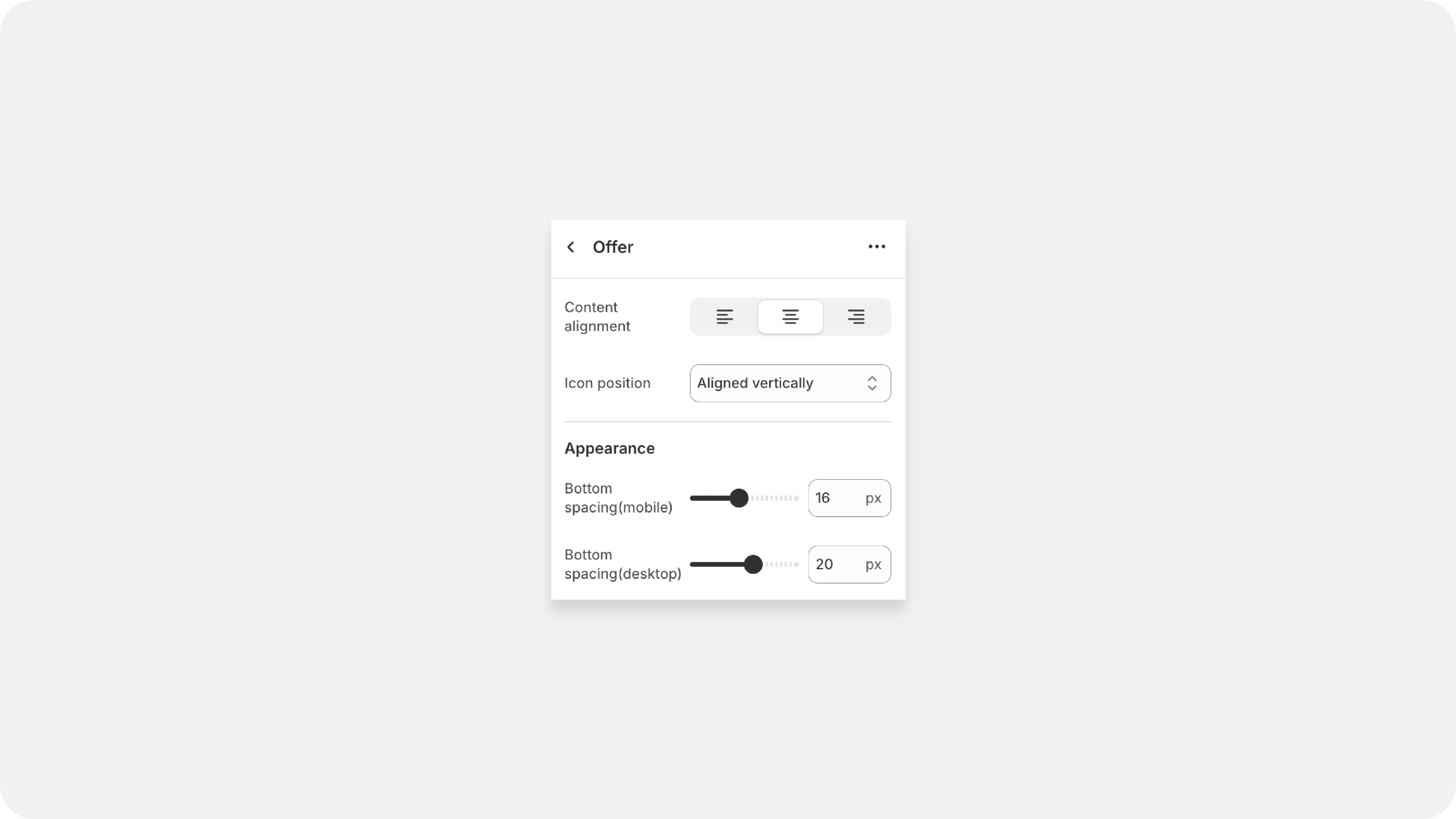
| Content Alignment | Controls the horizontal alignment of all the text inside the offer items (Left, Center, or Right). Use this to ensure all your offer text looks uniform and neat. |
| Icon Position |
Controls how the icon sits relative to the text. You have two main choices: • Aligned Vertically (Stack): The icon sits on top of the text in a column. Use this for maximum visual impact where the icon is prominent. • Aligned Horizontally (Parallel): The icon sits next to the text (side-by-side). Use this when space is tight, or you want a more concise, single-line offer. |
| Bottom Spacing (Mobile/Desktop) | This is your padding or breathing room! It controls the vertical space below the entire block, preventing it from crashing into the next section (like reviews). You can set different spacing for phone and desktop. |
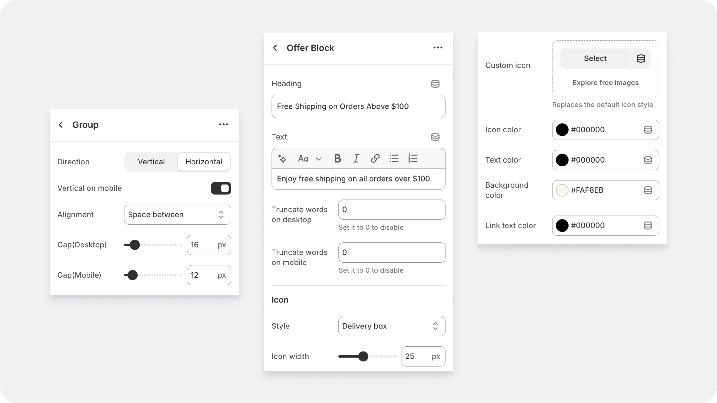
Group Block
| Direction | Decides if your offers are Vertical (stacked top-to-bottom) or Horizontal (side-by-side). Use Horizontal for desktop to show off multiple offers, and Vertical to ensure readability on smaller screens. |
| Vertical on Mobile | A mobile necessity! If your desktop layout is Horizontal, ticking this switch forces the offers to stack vertically on phones, guaranteeing a clean user experience. |
| Alignment (Space Between/Space Around) |
Controls how the available horizontal space is distributed between your offer items when they are set to Horizontal. • Space Between: Pushes the items to the edges of the group. • Space Around: Adds equal padding on both sides of each item. |
| Gap (Desktop/Mobile) | The specific space (in pixels) between each individual offer item, helping you fine-tune the visual flow and separation. |
Individual Offer Content
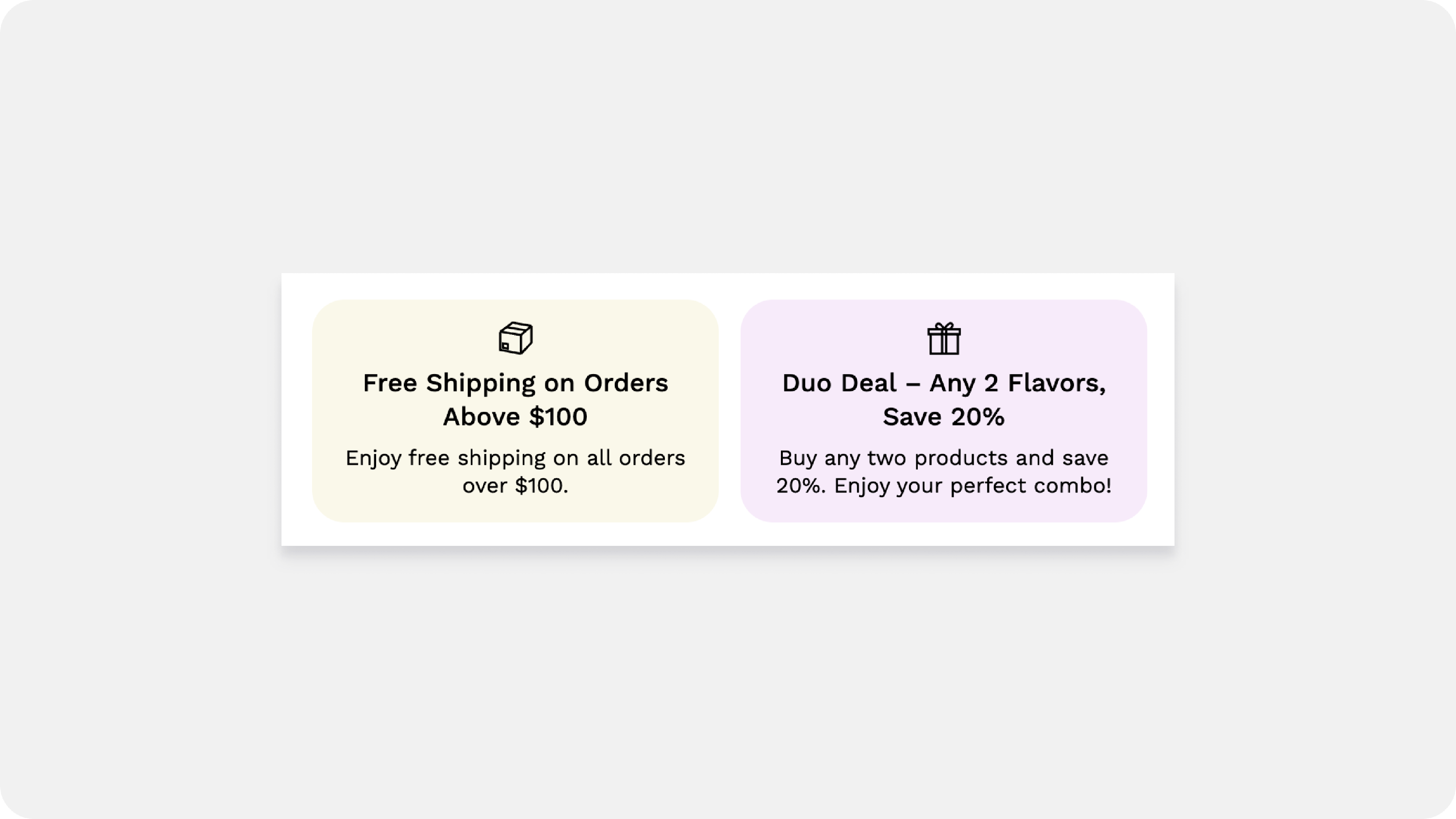
| Heading | The short, bold claim. This is the first, most important piece of information. Example: Free Shipping on Orders Above $100 |
| Text | The brief, supporting detail. Use this to gently expand on the heading. Example: Enjoy free shipping on all orders over $100. (Basic formatting is often available here). |
| Truncate Words | A display safety net. Set a number (or 0 to disable) to prevent long text from breaking your layout on small screens. It limits how many words show before they are cut off. |
| Icon Style | Select the visual symbol (like Delivery box ) that matches your offer. The right icon communicates the benefit immediately. |
| Icon Width | Adjusts the size of the icon in pixels (e.g., 25 px ). Make it visible without overpowering the text. |
| Icon Color | Sets the color of the symbol. |
| Text Color | Sets the color of the Heading and Text. |
| Background Color | Sets a subtle background color for the individual offer box, which can help it stand out from the page background. |
| Link Text Color | The color for any clickable link you embed within the offer text (e.g., linking to your full policy). |
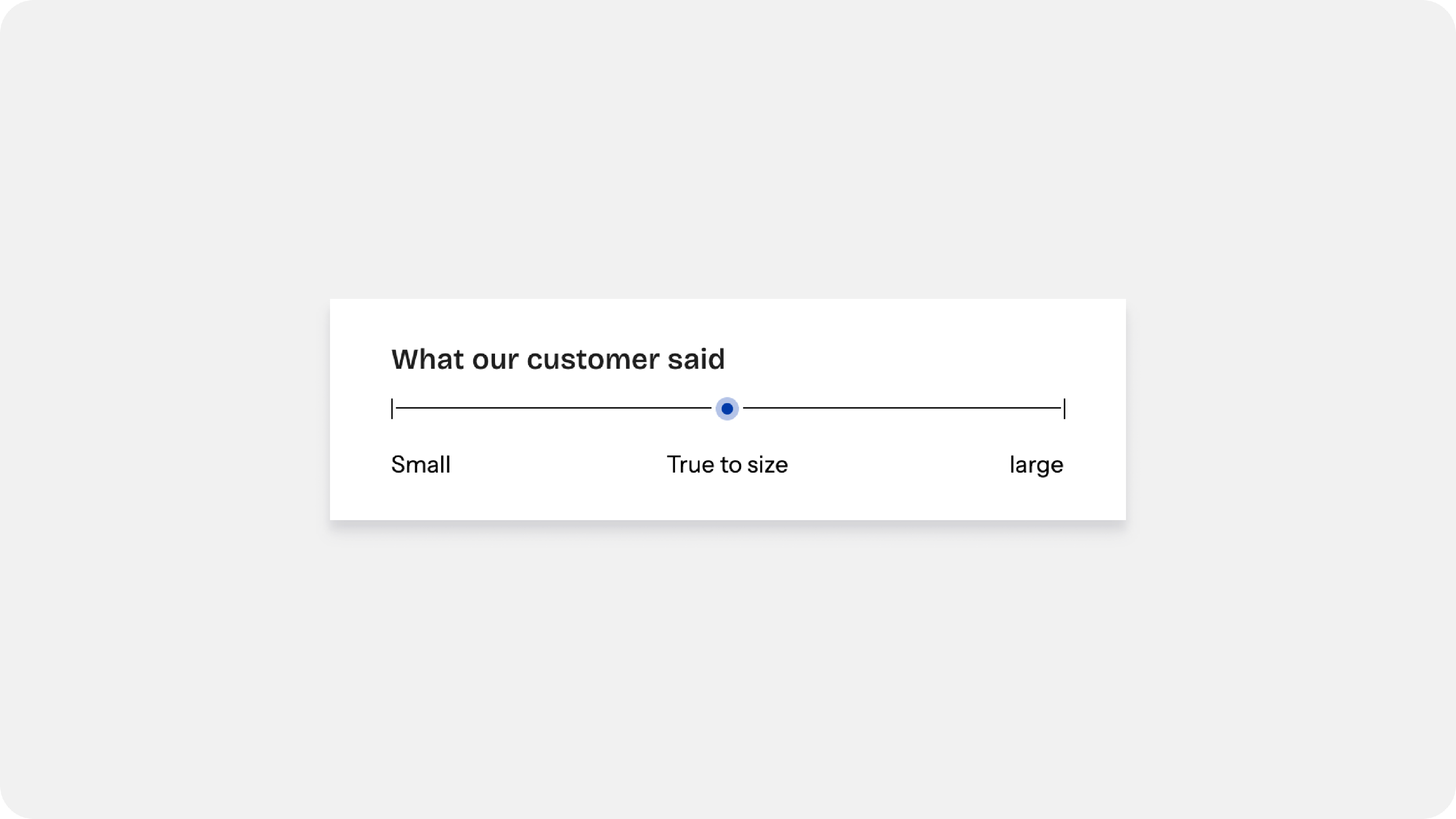
- The Fit Guide
Available from Flawless version 10.1
The Fit Guide is a visual scale that shows how a product usually fits. Instead of just guessing, customers can see at a glance if they should size up or down
Set the Header & Tooltip
| Heading | Give it a title, like "Fit Guide" or "How it fits." |
| Heading Tag & Size | These settings (H3, H4, etc.) help you match the text style to the rest of your store. |
| Tooltip Text | Want to explain more? Add text here, and it will appear when a customer hovers over the little (i) icon next to your heading. |
| Highlight Value | Tell the marker where to sit on the scale. (e.g., if you have 3 labels, setting this to "2" puts the marker in the middle). |
| Segment Highlight Style |
Circle: A classic round dot marker.(Adjust the size with Circle width). Line: A vertical line marker.
|
| Segment Thickness & Height: | Control how bold the main horizontal scale line looks. |
| Color Pickers: | You can change the color of the Line, the Marker, and the Text independently to make sure it’s easy to read. |
Adding Your Labels (Sub-blocks)
| Segment Label | Type the text for that specific point on the scale. |
| Content Alignment | Choose if the text should be Left, Center, or Right aligned to line up perfectly under the scale. |
- Line Item Property Block
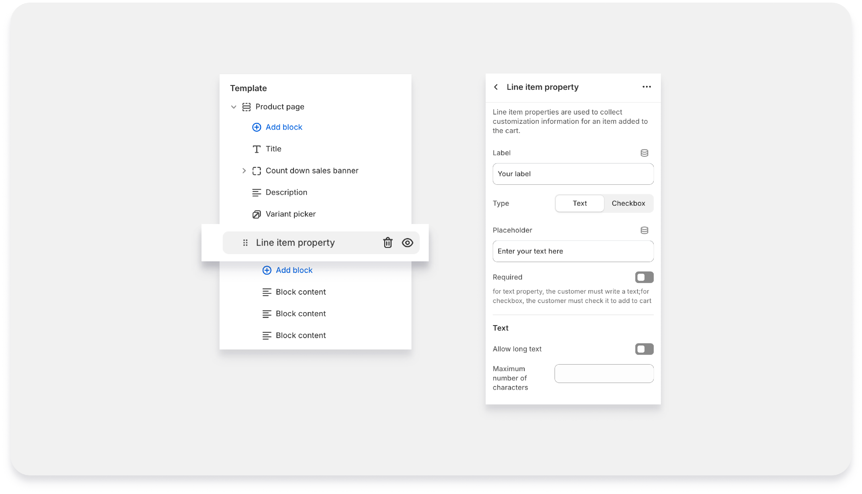
Available from Flawless version 10.1
The Line Item Property block allows you to collect custom information from customers before they add a product to the cart. This is useful when you need additional details such as personalisation text, order notes, gift messages, or confirmation checkboxes.
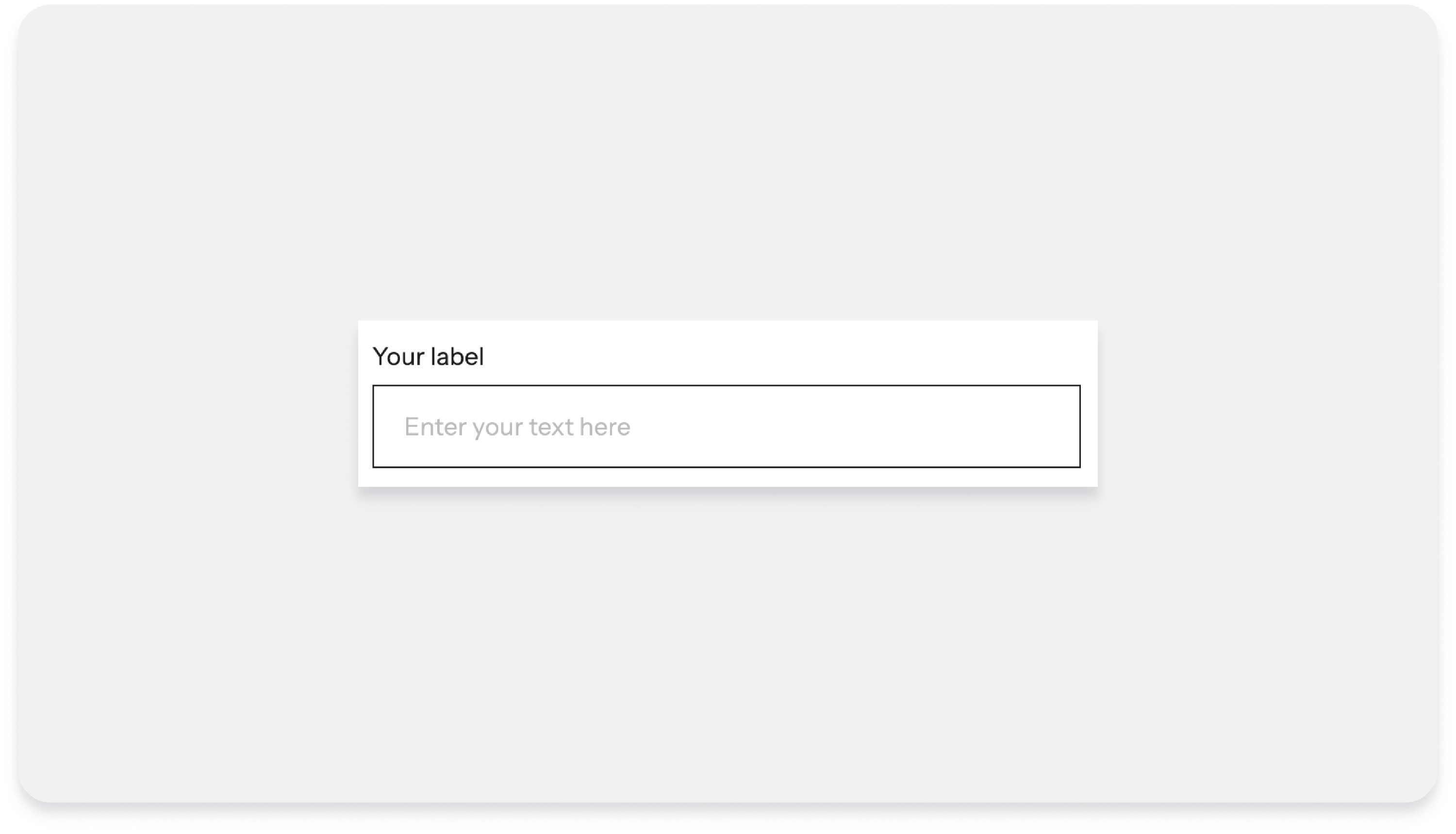
| Label | This is the title or name of the field shown to customers on the product page. |
| Type | This setting determines the kind of input customers will provide. |
| Text |
|
| Checkbox |
Note: If Checkbox is selected, the Placeholder and Text settings will not be available because a checkbox does not require text input. |
| Placeholder |
This is the example text shown inside the input field to guide customers on what to enter. Example:
The placeholder disappears when the customer begins typing. Note: This setting is only available when the Type is set to Text. |
| Required |
Enable this option if the field must be completed before the product can be added to the cart.
This is useful when the information is necessary to process the order. |
| Text Settings | These settings are available only when the Type is set to Text. |
| Allow Long Text |
When enabled, the input field allows longer or multi-line text, making it suitable for longer messages or detailed instructions. Example uses:
When disabled, the field behaves as a single-line input. |
| Maximum Number of Characters |
This allows you to limit the number of characters a customer can enter. Example:
Setting a limit helps prevent overly long entries and ensures the text fits your product customization requirements. |
- UGC Reel.
Available from Flawless version 11.0
When a shopper lands on your product page, they're already interested — but they still need that final nudge. UGC videos do that better than any product photo. Seeing a real person wear, use, or review the product right there on the PDP removes doubt and makes the decision feel easy.
| Heading text | The title customers see above your reel. Try something like "See it in action." Leave blank to hide it. |
| Heading tag | Tells search engines how important this heading is. Stick with H2 — it's the right choice for most sections. |
| Size | Controls how big the heading looks — separate from the tag. Use H1 size for a big bold look, H2 for standard |
| Layout style |
The shape of each reel card. Portrait — best for video Circle — social style Square — clean grid |
| Show highlight border | Adds a colored ring around each card. The color matches your play button color automatically. |
|
Play first video
On / Off
|
When on, the first reel plays automatically as customers scroll to it (muted). Great for grabbing attention fast. |
|
Show quick buy
On / Off
|
Lets shoppers add to cart straight from the reel — no need to visit the product page. Turning this on can boost conversions, especially on mobile.
|
| Quick buy style |
How the add-to-cart experience appears. Card : A compact panel sits below the video with the product name, price, and a quick add button. Overlay : Product name and add button appear directly on top of the video thumbnail — no extra panel. Thumbnail : A small product image (thumbnail) sits beside the product info below the reel. Position can be Left or Right. Button : Use a. clear buttons below the reel — "View Product" |
| Variant style |
Controls how size and color variants are displayed inside the quick buy panel. Dropdown — compact, saves spacePills — buttons side by side
Pills are easier to tap on mobile. Dropdown works better if you have lots of options (e.g. 10+ sizes).
|
|
Show swatches
On / Off
|
When on, color variants show as visual color swatches instead of text labels. Makes it much easier for shoppers to pick a color at a glance. Turn this on if your product has color options — it makes the experience feel much more polished.
|
|
Swatches style
Dropdown / Pills
|
Controls how the color swatches are displayed — same idea as Variant style but specifically for swatches. Dropdown — compact swatch pickerPills — swatches shown inline
This setting only applies when Show swatches is turned on.
|
| Button icon | Color of the icon inside the add-to-cart button (e.g. the + or bag icon). Defaults to white. Make sure it contrasts with the button background. |
| Button background | Fill color of the add-to-cart button. Defaults to black. Pick something that stands out on your reel cards. |
| Background | The background color of the quick buy panel itself (the area below or on the reel). Defaults to white. |
| Overlay | A dark tint that sits on top of the video to make the text and buttons more readable. Set to "Linear gradient" by default — fades from transparent at the top to dark at the bottom, so it doesn't cover the whole video. |
|
|
|
| Play button background | Fill color of the play button circle on each reel. |
| Play button icon | Color of the play triangle inside the button. Default is white. Make sure it contrasts well with the button background. |
UGC reel block ( Child block)
| The Video (The Main Event): |
Click "Select" in the Video section to upload your MP4 or MOV file.
|
| Image |
|
- Gift Wrap


| Default Gift Wrapping Label | Customize the text displayed to customers for the gift wrap option. |
| Gift Wrapping Product | Select the product that will be used as the gift wrapping add-on. This product will be automatically added to the cart when customers choose the gift wrap option. |
| Icon Color | Choose the color of the gift wrap icon displayed beside the gift wrap option. |
| Border Color | Customize the border color of the gift wrap block to better match your store's design. |
| Bottom Spacing (Desktop) | Adjust the amount of space below the gift wrap block on desktop devices. |
| Bottom Spacing (Mobile) | Adjust the amount of space below the gift wrap block on mobile devices. |
21 . Custom Liquid
- Custom Liquid Code: Add custom HTML, CSS, or JavaScript code for advanced customization.