
Default Collection

An exclusive page designed to showcase the products within a collection. To access this page in the editor, simply click on the page dropdown located at the top center of the editor, then select 'Collections' from the list. This page offers two templates: one with a collection banner and one without. Choose the template that best suits your needs and assign these pages through the shopify admin collection settings.
Collection banner settings

- Banner Width: Choose whether to have a full-width banner or a fixed-width banner.
- Title Display: Option to show the collection title in the banner.
- Description Display: Option to show the collection description in the banner.
- Collection Image Usage: Use the collection image as the banner image.
- Text Size Control: Control the size of the text displayed in the banner, ranging from H1 to H6.
- Custom Banner Image: Add a custom banner image if the default collection image is not suitable.
- Image Size Adjustment: Adjust the size of the banner image with options such as small, medium, large, and adapt to image.
- Overlay Settings: Add an overlay to the banner image for better text visibility.
- Opacity Control: Adjust the opacity of the banner image or overlay.
- Color Scheme: Choose a color scheme for the banner text and overlay.
-
Custom CSS: Add custom CSS to further style the banner.
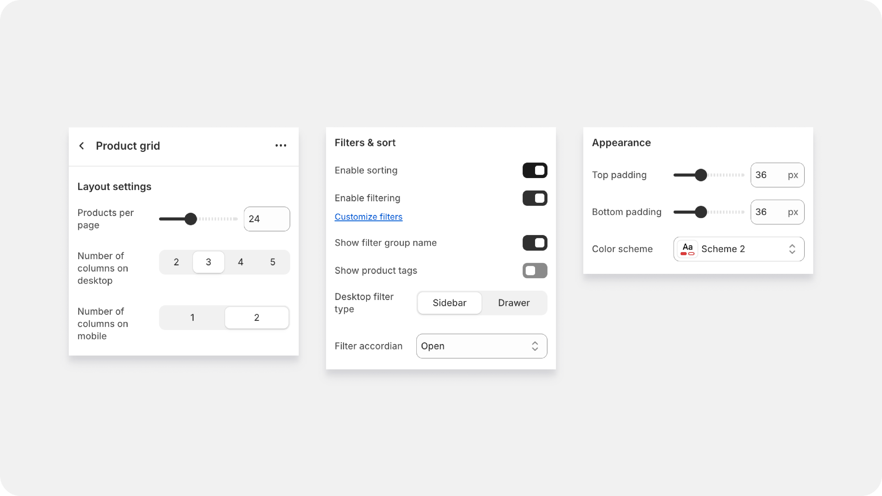

Product grid settings
The Product Grid section settings allow you to customize how products are showcased within a collection. Below are the available settings and their descriptions:
1. Products Per Page:
- Description: Define the number of products displayed per page in a collection.
2. Number of Columns:
- Description: Set the number of columns for displaying products.
- Options: Specify separate settings for desktop and mobile views.
3. Filter & Sort Options:
- Description: Enable the option to filter and sort products within the collection.
4. Additional Filter Options:
- Show Product Tags: Display product tags as filter options.
- Filter Group Name: Set names for different filter groups.
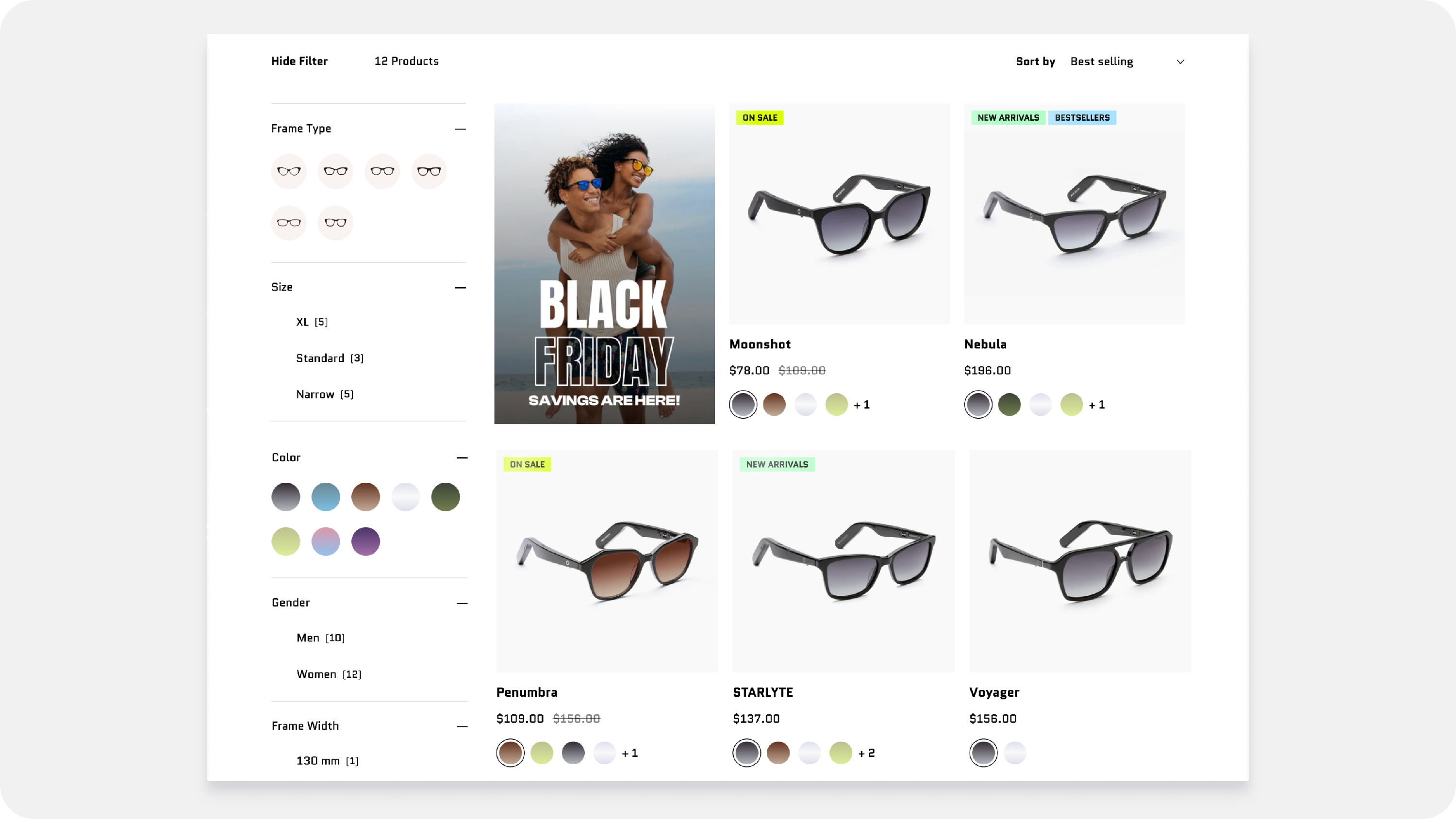
- Filter Layout: Choose the layout of the filter, either sidebar or drawer.
5. Filter Accordion Style:
- Description: Configure how filter groups are displayed within the accordion.
- Options:
- All groups open.
- All groups closed.
- Only the first group open.
- Options:
6. General Appearance Settings:
- Padding: Adjust the padding around the product grid.
- Color Scheme: Select a color scheme for the product grid section.
- Theme Settings: Apply theme-specific settings to the product grid.
- Custom CSS: Add custom CSS for advanced styling and customization.
Promo Card block
This block allows you to insert a high-impact, custom card directly into your product listings. Think of it as a dynamic advertisement that breaks up the grid and guides customers to special collections or campaigns!
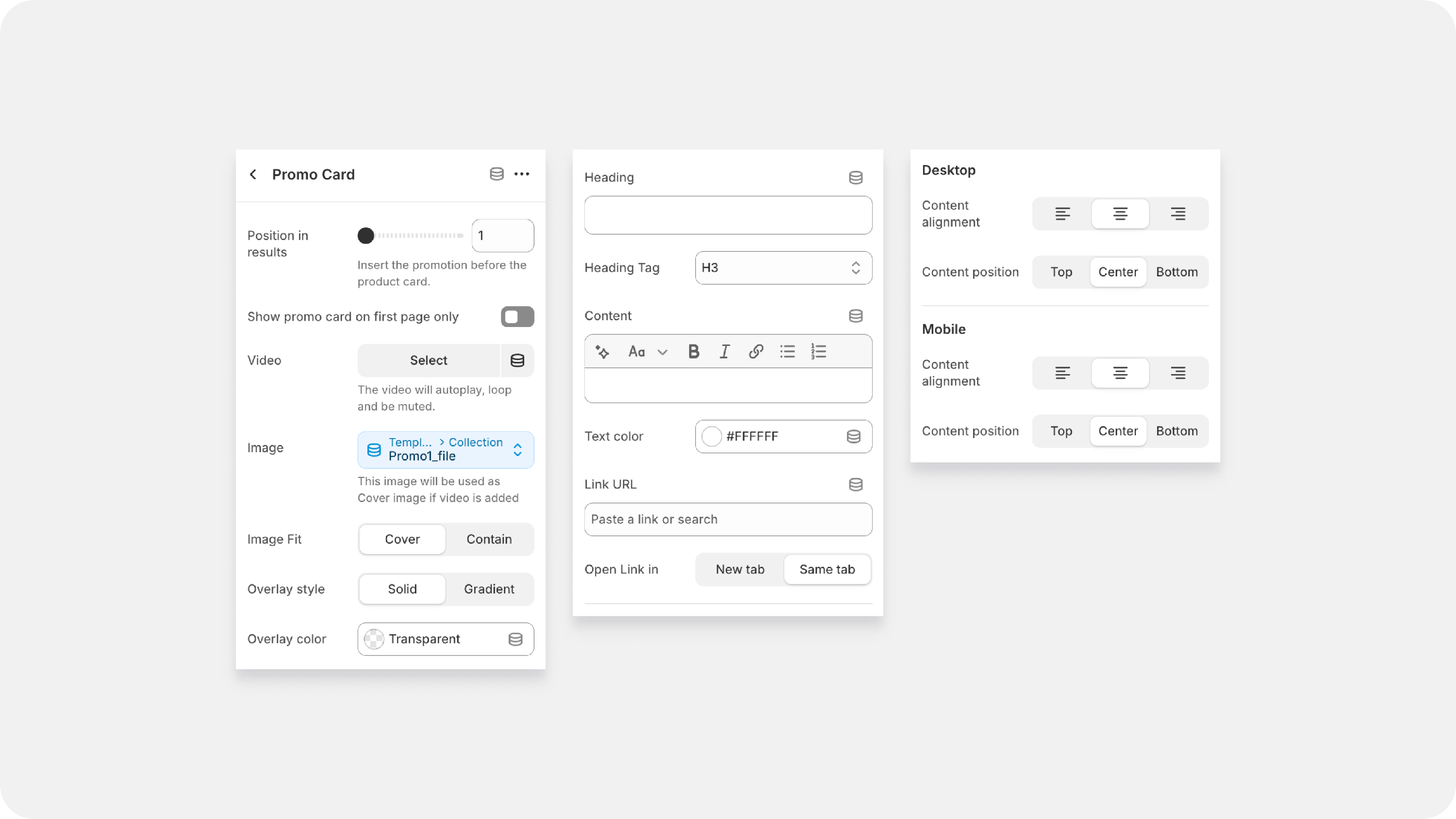
| Position in results | Controls the card's placement. Setting this to 1 means the card will show up in the first product slot, 2 in the second, and so on. Use a prominent, early number (like 1 or 2) for your most important promotions. |
| Show promo card on first page only | A smart way to manage repetition. When enabled, the card will only appear on the first page of your collection results, keeping the customer experience clean as they browse deeper into your catalog. |
| Video / Image | Upload your visual content. You can choose to use a compelling Image (like a high-res campaign photo) or a Video (which will usually autoplay, loop, and be muted) to instantly grab attention. |
| Image Fit | Controls how the image fills the space: Cover ensures the image fills the entire card (cropping where necessary), while Contain ensures the entire image is visible (potentially leaving white space). |
| Overlay Style | Choose the shading that sits on top of your image. Solid applies a single, uniform color filter. Gradient applies a fading color, often darker at the bottom to make text stand out. |
| Overlay Color | The color of the filter. Use a dark color (like black or dark grey) set to a low opacity for a transparent filter, which helps text pop against bright images. |
| Heading / Heading Tag | The main headline of your promotion (e.g., BLACK FRIDAY ). The Heading Tag (H3, H4, etc.) is important for SEO and structure. |
| Content | The supporting text or call-to-action (e.g., SAVINGS ARE HERE! ). Use the formatting tools (Bold, Italic) to emphasize key words |
| Text Color | Sets the color of your Heading and Content. You often need to set this to white (#FFFFFF ) to make it readable against a dark overlay. |
| Link URL / Open Link in | Where the card takes the customer! Set the specific collection page or product page here. You can choose to open it in the same window or a new tab. |
Desktop & Mobile Alignment:
| Content Alignment | Horizontal positioning of the text block (Left, Center, Right). |
| Content Position | Vertical positioning of the text block (Top, Center, Bottom). |
| Mobile Settings | Allows you to override the desktop position for phones. Since mobile screens are tall and narrow, you often need to adjust the vertical position (e.g., move the text to the bottom) to avoid covering the most important part of your image. |
Collection Tabs


Available from Flawless version 11.1
| Display Style | Choose how your tabs look. You can display them as Cards (Image slightly bigger with text stacked), Image with text (creates the clean look with text parallel to image ), or Text only |
| Image Fit | Choose Contain to show your full product images without cropping, or Cover to let the image completely fill the shape. |
| Border Radius | Slide this up to round out your images. Setting it to a higher number (like 42px ) is what turns your square images into those beautiful circles! |
| Content Position | Quickly align your collection tabs to the Left or Center. |
| Collections | Click Change to select, reorder, or swap out the exact collections you want to feature in this bar. |
| Highlight collection titles: | Simply type the exact name of the collection into this text box. To highlight multiple collections, separate them with a comma (e.g., tshirts, jackets ). |
| Highlight text color |
Pick an eye-catching color for the Highlighted collection text. 💡 Quick Tip: Use the highlight feature to steer your customers directly toward your highest-margin collections or seasonal clearances! |
|
|
|