
Media banner
A single large image or video with text laid over it. Supports floating images that drift as the page scrolls, and is the section to pair with a transparent header.
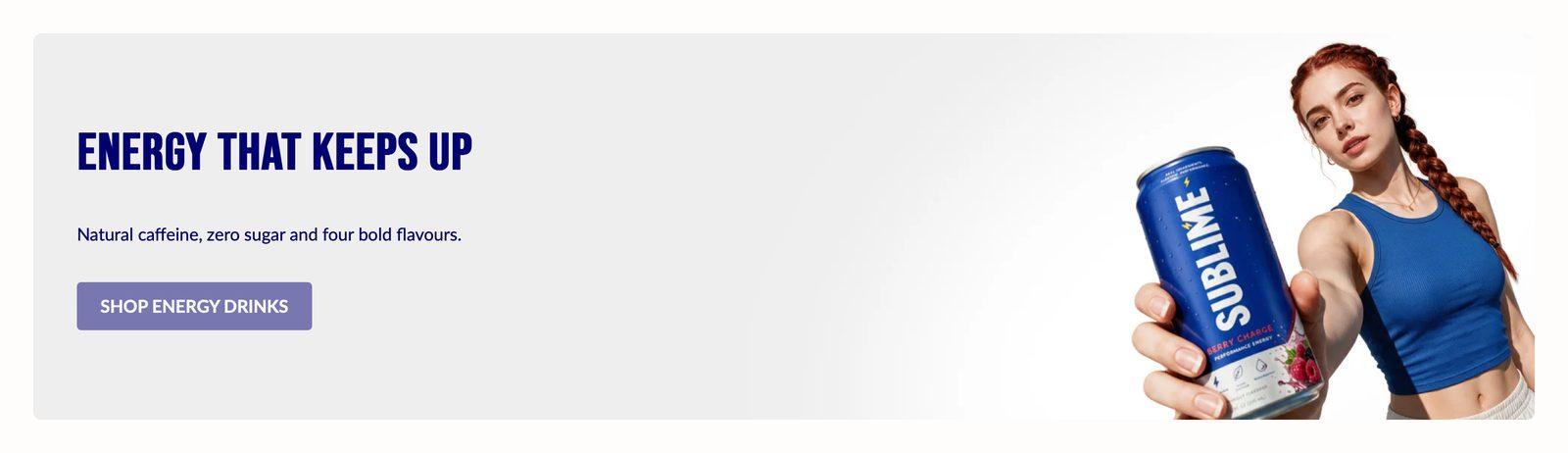
At a glance: Add it to any page with Add section.
Good for
- A full-width hero at the top of the homepage, under a transparent header
- A campaign video playing silently behind a headline
- Layered floating product shots that drift as the page scrolls
How to add the section
- From your Shopify admin, go to Online Store → Themes and click Customize on Sublime.
- Open the page you want to edit from the dropdown at the top of the editor.
- In the left sidebar, click Add section.
- Search for Media banner and select it.
- Drag it into position, adjust the settings below, and click Save.
Section settings
Parallax
| Enable parallax | Moves the image at a different speed from the page as it scrolls. Subtle values read as depth; strong ones as motion.
On by default. |
| Enable parallax on mobile | Keeps the parallax effect on phones too. Leave it off if the motion looks jumpy on small screens. On phones the banner then scrolls normally.
Off by default. Only appears when Enable parallax is on. |
Media
| Enable full width | Stretches the section edge to edge instead of holding it inside the page container.
On by default. |
| Media type | Choose whether the banner's background is a still image or a looping, muted video. Each choice has its own upload fields.
Choose Image (default) or Video. |
| Desktop background image | Background image used on desktop.
2880 x 1280px (large) .jpg recommended. Only appears when Media type is Image. |
| Mobile background image | A separate image used on mobile. Leave empty to reuse the desktop image.
800 x 1000px .jpg recommended. Only appears when Media type is Image. |
| Desktop background video | Video shown on desktop.
Only appears when Media type is Video. |
| Mobile background video | A separate, usually lighter video for mobile.
Only appears when Media type is Video. |
| Desktop cover image | Shown before the video plays. Leave it empty to use the video's own preview frame.
Only appears when Media type is Video. |
| Mobile cover image | A separate cover image for phones. Leave it empty to use the desktop cover image.
Only appears when Media type is Video. |
| Desktop media size | Image size on desktop.
Choose Small, Medium (default), Large, Full screen or Adapt to image. |
| Mobile media size | How tall the image is on mobile.
Choose Small, Medium (default), Large, Full screen or Adapt to image. |
| Overlay opacity | Darkens the image behind the text so the text stays readable. Higher values mean a darker image.
Adjustable from 0% to 100% (default 20%). |
Desktop layout
| Content alignment | Aligns the text content within its column.
Default: Left. |
| Content position | Where the text block sits over the image, with nine positions from top-left to bottom-right.
Choose Top left, Top center, Top right, Middle left, Middle center (default), Middle right, Bottom left, Bottom center or Bottom right. |
Mobile layout
| Content alignment | Text alignment on mobile.
Default: Left. |
| Content position | Where the text block sits over the image on mobile.
Choose Top left, Top center, Top right, Middle left, Middle center (default), Middle right, Bottom left, Bottom center or Bottom right. |
Large text
| Show large text | Adds a line of oversized display text to the section.
Off by default. |
| Large text | Oversized display text, usually a single word or short phrase.
Only appears when Show large text is on. |
| Large text position | Inline keeps the oversized text inside the banner, lined up with the content. Overflow moves it to the bottom edge so half of it hangs below the banner, over the next section.
Choose Inline (default) or Overflow. Only appears when Show large text is on. |
| Large text color | Color of the oversized display text.
Default: #ffffff. Only appears when Show large text is on. |
Appearance
| Color scheme | Sets the background, text, border and button colors for the section. Schemes are defined once in Theme settings → Colors and reused everywhere, so changing a scheme updates every section using it. |
Spacing
Top and bottom spacing for desktop, with optional separate values for mobile. These are the same controls on every section. See Settings every section shares.
Blocks
Blocks are the individual pieces inside the section. In the sidebar, click Add block under the section to add one, and drag blocks to reorder them. The order in the sidebar is the order on the page.
Floating images block
Image 1–2
Each of the 2 images has the same settings, set separately for each one.
| Image | Custom image for this slot.
800 x 1000px .jpg recommended. |
| Desktop size | Width of the floating image on desktop, as a percentage of the banner's width.
Adjustable from 5% to 100% (default 30%). |
| Mobile size | Width of the floating image on mobile, as a percentage of the banner's width.
Adjustable from 5% to 100% (default 30%). |
| Desktop horizontal position | Where the floating image sits across the banner on desktop. 0% is the left edge, 50% the center and 100% the right edge.
Adjustable from 0% to 100% (default 50%). |
| Desktop vertical position | Where the floating image sits down the banner on desktop. 0% is the top, 50% the middle and 100% the bottom.
Adjustable from 0% to 100% (default 50%). |
| Mobile horizontal position | Where the floating image sits across the banner on mobile. 0% is the left edge and 100% the right edge.
Adjustable from 0% to 100% (default 50%). |
| Mobile vertical position | Where the floating image sits down the banner on mobile. 0% is the top and 100% the bottom.
Adjustable from 0% to 100% (default 50%). |
Tips
- Always set a cover image for video. It shows while the video loads, and when a phone won't autoplay it.
- Keep background videos short and light. A 10–20 second loop under about 10MB starts quickly on mobile.
- Floating images work best as cut-outs. A product on a transparent PNG blends into the banner better than a photo with a background.
- Try Overflow for large text. It lets the oversized word hang half over the next section, which ties the two sections together.
Troubleshooting
My video isn't playing
Set Media type to Video and upload a file under Desktop video. Videos play muted and loop. YouTube and Vimeo links aren't supported here. For those, use the Video section.
The floating images don't move
They only drift when Enable parallax is on. On phones, Enable parallax on mobile must be on too, otherwise they stay still in their mobile position.
The large text isn't showing
Turn on Show large text and enter something in the Large text field. Both are needed.